


I haven’t talked about my friends at Interswitch for a while. My very good friends, they are. Really.
We’ve gotten along famously after my infamous “disrupt Interswitch” article on TechLoy, and I’ve had stimulating conversations with a couple of their people. To my relief and delight, I found that they are human afterall, even if they they could do with some empathic enhancement steroids.
I hope they don’t think we’ve forgotten about them. As if we can.
Besides, bloggers have long memories, and even if everybody else has, I haven’t forgotten about all the stuff they promised to do at the October CcHub Dev Parapo in October last year. Stuff that included cleaning up their code base, releasing documentation that english-speaking developers can comprehend and of course participating a lot more in ecosystem via hackathons and community activities like that.
But since that last meeting, all I’ve seen happen from their end that is remotely ecosystem related was their own version of the harlem shake.
Actually, there IS something that they’ve done. And they did it a while ago, but I don’t think it’s been publicly recognised for what it is. I can’t recall when exactly it was they did this, but someone somewhere in Interswitch decided they’d go into a fundamental aspect of their system and clean it up. They revamped their payments module.
The payments module is probably the single most important component of the Interswitch value chain, obviously because that’s where people hand over the money. For many, it is the one and only place where they will ever encounter the company.
And it was horrible. Just horrible. And not just because it looked ugly…which it did…but also because it was such a pain to use. I didn’t really understand it at the time, but I could always feel this ball of trepidation knotting in my stomach anytime I was going to do an Interswitch transaction.
Then they fixed it. It took a while to sink in, but after I’d spent some time interacting with the new payment module, I realised how monstrously bad the old payments module used to be. Here, take a look –
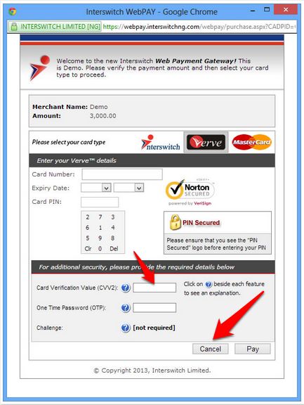
That was before. You might have noticed that it now looks like this –
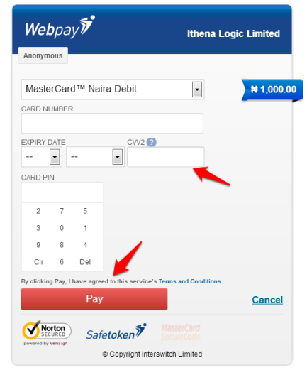
So what makes the new payments module better? I know that compared to the new one, the old module looks positively hideous, but that’s not what I’m really getting at. The arrows I’ve used to annotate the images don’t exactly convey the idea, but I’ll highlight four distinct things that have happened here.
- The CVV2 field was moved up to be with the other number entry fields – this for me was the single most important UX upgrade they made on the module. They could have done just this and gone home.
- They got rid of the useless gunk that used to clutter the module, and it’s now noticeably simpler, minimal even.
- The “decision buttons” have been fixed. But seriously, which sort of genius decided to put the the “cancel” button before the “pay” button and then made both of them almost identical in the first iteration? Sheesh.
- The new module is now very optimised for mobile. I even tried it on the dumbest version of Opera Mini I could find.
One more thing might be that the module no longer re-directs off-site or into an iframe. Not too sure about that, but it hasn’t on the sites I’ve tested it on.
While I don’t fancy myself a designer in the purest sense of the term, I’m something of a UX nut, and I had never imagined that such a small change could have such a profound calming effect on my blood pressure. I just noticed that after using that module (successfully) a few times after the re-design, I didn’t feel that knot in my gut anymore.
Beyond the “cosmetic” upgrades (they aren’t, really), I don’t know if they’ve done some stuff under the hood to make the payment module work better and have a lower failure rate. But like every good designer knows, there’s just something reassuring about an interface that looks good and is thoughtfully laid out. That’s probably why even when the Interswitch payment gateway doesn’t work, these days I’m somehow never angry enough to take to Twitter and rant about it like I was wont to. Something about the process has become so much less cognitively tasking that I can now shrug it off and go on with my life.
I hate Interswitch less because they moved the CVV2 field a few pixels up.
Might not sound like a lot, but it is a big deal to me. Especially because it took a while for me to realise it. And that is what good design does. You hardly know it’s there. Way to go, Interswitch.
Now, back to the matter. Payments are still broken. And how about all the pledges you made to the ecosystem last year? No, Harlem Shake doesn’t count. Count on us having a vigorous conversation on this topic very, very soon.