In the beginning, it was said that having a website was absolutely necessary. While that might be true, having a website today goes beyond the functionality and has more to do with the user experience or emotional connection.
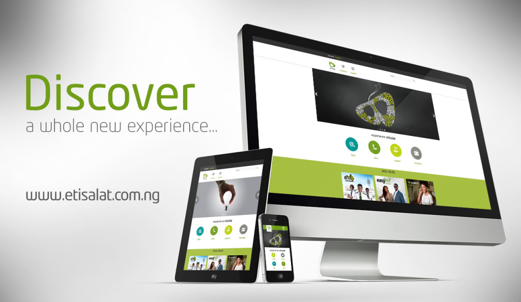
What are we saying? We live in a time and age where a website does not just connote a web presence but a rich multimedia experience defined by how users interact with the system. As a company that is customer centric, Etisalat created its new website for the visiting pleasure of the user. So no matter where you come from whether desktop, mobile, or TV browsers; we simply created the ultimate website experience.
1. User Centric Design
We designed an experience that does not need to be learned but intuitive. Our philosophy is if a user has to think through it, then it is not good enough. Knowing that the user is the real hub of activity, we selected best case scenarios for user journey and user interaction from a series of mapped out use case scenarios.
2. Simplicity & Consistency
If you have to try to understand it, then it is not simple enough. We’ve simplified content and context so much to natural level by organizing text, call to action buttons and banners to be clear, concise, legible and straight to the point.
The feel of equality on both web and mobile versions of the website brings a feeling of consistent familiarity that backs an assurance of catering for everyone irrespective of browsing environment.
3. Responsive Layout
We have made the user, the ultimate decision maker in terms of the experience a user gets based on his device type, browser type or device screen resolution.
We introduced reflow configurations that makes the website adjust to whatever device type the user has, so nothing is missed out. The experience we have created does not limit a user to his device no matter how low end the device is.
4. Readability
We understand that users want to find what they want, in an ordered manner and simply too, they don’t want to read through too much content to find something.
We put content ahead of design by organizing our content into blocks of few specific words that reduce cognitive load on users. We’ve made the content easily scanable by the eyes to a few lines and trimmed down to simple easily understood English.
5. SEO
We’ve made information about us so easy to find. This we have done with On-page, off-page and image optimizations. Leveraging on well-defined taglines, header tags, standard meta descriptions, structured data markup, keywords in URL with SEO (link) structures and rich snippets, preview of pages can easily be found in search results with enough information that increases click-through rate and generates leads.
Our site map is periodically updated for search bots (Google/Bing/Yahoo indexing system), so we always have fresh and not stale content. Deep linking techniques employed has seen our links achieving far more reach, we have even achieved this further with domain referrals.
6. Low Bounce Rate
We identified and nipped bottlenecks that caused visitors who land on the website to get out without moving further on to other pages of the site and our efforts have paid off as we see visitors coming to our site and spending time there moving from one page to another, reading the content and clicking through.
7. Performance
We have achieved a website performance that is best in our industry. Our website loads fast with speed of about 2 secs and average load time of about 4 secs. It is also optimized even for low internet speed situations.
8. Utility Hub
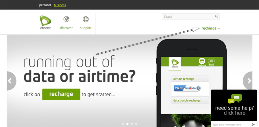
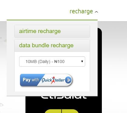
Buying, using and sharing are key to life online. We have empowered our customers by providing utility features on our website such that they can buy airtime or data for themselves, friends or loved ones as well as subscribe to some of our services.
Day or night, irrespective of location, our customers can simply recharge from our website.
Conclusion
The Etisalat Nigeria website is ranked the most visited telco website in Nigeria and with the best user experience rating.
Yes, we are happy with the results we are seeing but not relenting in our efforts in ensuring continuous improvements to the website. We are always researching, continually reviewing the entire website, engaging our visitors on their satisfaction levels, areas of improvement and of course continuously providing enhancements.
As a brand truly dedicated to providing a best-in-class experience online, we keep pushing ourselves to ensuring the Etisalat Nigeria website is constantly in sync with advancements in technology and changes in human/user behavior.


