As you probably already know, we were given the Tecno Boom J8 to review and I took it upon myself to do that. Because new phones are such fun things to experience, you know. Anyway, I spent a week with this phone, invested in it, and gave it (or tried to give it) my absolute attention. One week is enough to decide if you like a phone or not, yes? Yes??
Before I go into the whole “review” thing, I’m just going to say I judged it based on my expectations (from reading the specs sheet) and based on the stuff the Tecno people said in their video.
First of all, I’m just going to reel off random specs so you have a general idea of what this phone is about. The Boom J8 has a 5.5-inch IPS display with a resolution of 720 x 1280 pixels. It’s plastic with a metal frame, and it comes with 2GB RAM, 16GB internal memory (with microSD external storage for up to 128GB). It runs on Android 5.1 Lollipop with a customised U.I called Hi-OS and supports GSM, 3G and 4G. Dual (micro) SIM, 13MP rear camera with LED flash, 5MP front-facing camera also with flash, in-built, non-removable 3000mAh battery – and all this comes in a phone that costs about N45,000. So yeah, the Boom J8 is a mid-range phone.
Hardware
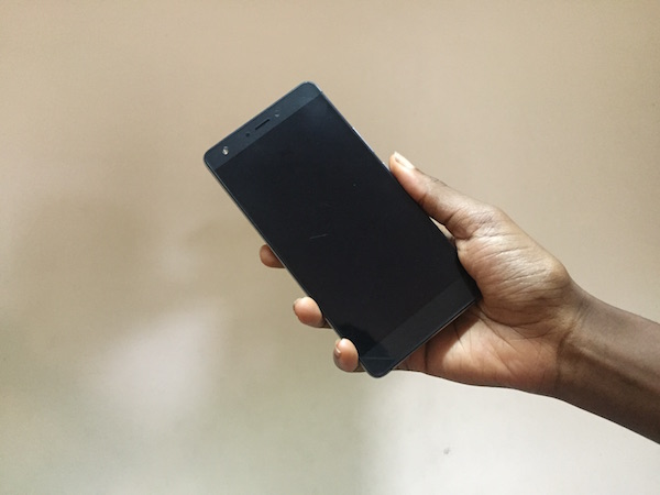
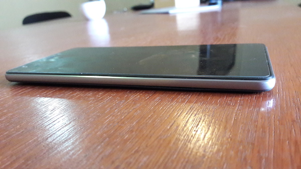
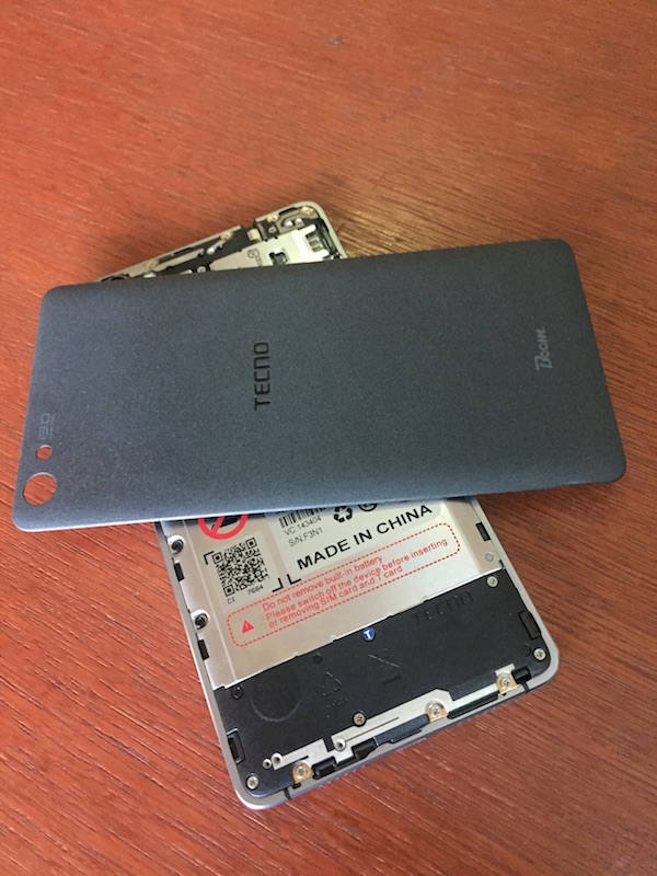
According to Tecno, their engineers went through 172 processes to ensure the Boom J8 is simple, stylish and slim. Well, let’s say they succeeded. Despite the size, the phone fits well into the palm and the fact that it’s pretty slim helps with the grip. Personally, I like the coarse feel of the back, but I read that that’s peculiar to the ones that come in black. The white Boom J8 has a sleek plastic back cover.
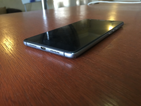
The volume and power buttons are on one side of the phone – the right side. Now, this took a little getting used to, and I was always pressing a volume button instead of the power one. But all in all, it wasn’t a bad experience.
The top of the phone features the audio jack, and the speakers and USB port are under. Okay, so I had a discussion with a few people about the right place to put the earphone jack on a phone, and what they said is the best place is under. I think on top is the right place, and someone else agrees with me, but I’m not going to discuss that here. The audio jack being on top didn’t ruin the experience for me so I guess it all boils down to preference.
Having the speakers under the phone was a great choice – that, I have to say – so there was no sound muffling or whatever. Technically, it’s just one speaker (the holes on the right side produce no sound) and although it’s loud, the quality isn’t great. At the highest volume, the speakers vibrate so the sound gets a tad annoying. So no, the Boom J8 does not have symmetric loud speakers with deep bass.
One thing I don’t understand, though, is why Tecno decided to ditch capacitive buttons for on-screen buttons. There are lots of discussions about why this is not a good idea, but I’ll just say capacitive buttons mean more screen space.
Below the screen is a horizontal strip (or “Breathing Light”) that lights up when a notification comes in or when music is playing. (I do not know why this is even a feature). I do not understand why an LED notification light cannot be at the top of the screen, and I don’t know why I need a pulsating light to tell me music is playing. Essentially, I’m not totally on board with the idea(s) behind the entire design.
All in all, the phone’s physical form is sturdy, simple, and it looks good. Hell, it looks great and it feels great too. It’s not heavy and handling it, either one-handed or two-handed, wasn’t a chore.
Software
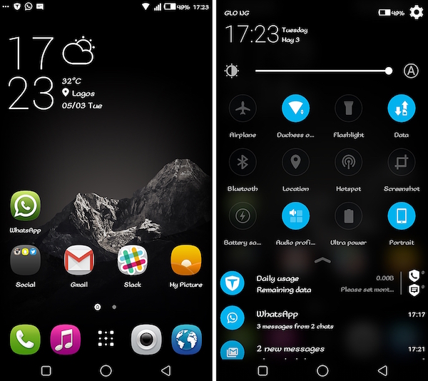
The Boom J8 runs on Android 5.1 Lollipop with Tecno’s customised UI, Hi-OS. Is it just me or is does the name sound like an Ibadan person trying to pronounce iOS (again with the iPhone comparison)? Anyway, the first thing I’m going to say is Tecno needs to invest in icon pack design. Seriously. Most of the icons are ugly, but we’ll discuss that later.
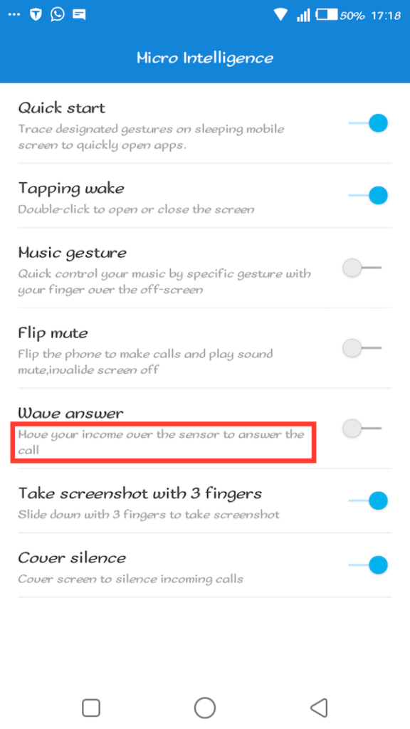
Hi-OS is smooth; the animation/transition has a great feel to it and there are nice gestures that come with. It’s called “Micro intelligence” and you can do stuff like slide three fingers down the screen to take a screenshot and cover the screen with your palm to silence incoming calls.
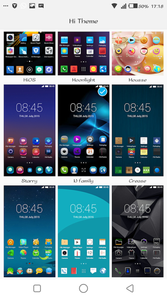
I liked that Tecno provided choice when it came to personalising the look of the phone. There’s Hi Wallpaper, Hi Theme and Hi Font. Now, I feel they really could have invested more in providing aesthetically pleasing choices, but it’s the thought that counts. Each Hi-theme comes with it’s peculiar icon pack, and I’m sure the intention was to be different or “hip”, but the icons are just…not.
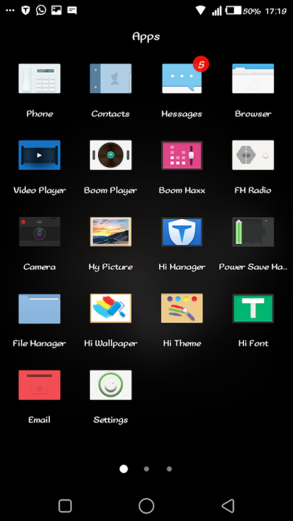
Some icons (across all themes) are just plain confusing and you might have to read the label to know what app it is. Which, to me, doesn’t make much sense. An icon is a pictorial representation of an app. I don’t want to have to read a label. There’s supposed to be some sort of symbolic interaction when I look at an icon. One does not simply put weird shapes on a screen and force the user to make sense of it.
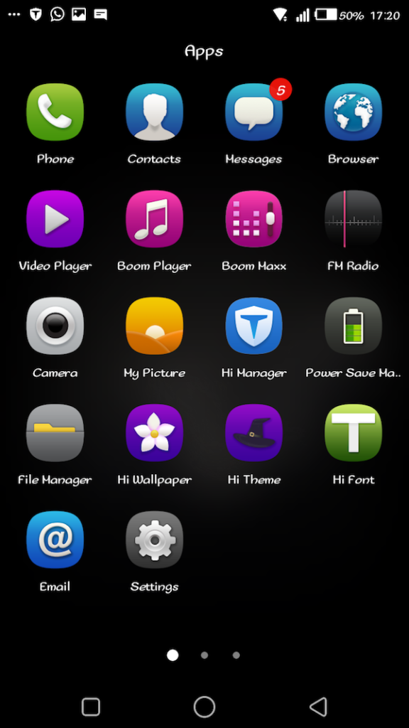
In my opinion, the best theme is “N family”. But I guess if you’re really into tweaking the look of your Android, you already know what launcher and icon pack to get (nooova…launcheeeer).
One other thing I don’t like is how notifications come in. Sometimes, notifications come in after I open an app (especially Whatsapp and Slack), and obviously this wasn’t a pleasant experience. Secondly, not all app icons show on the notification bar. What I mean is, I may know I have a notification, I just won’t know what app it’s from until till I draw down the notification bar. For example, notifications from Gmail or Slack appear as ellipses on the bar.
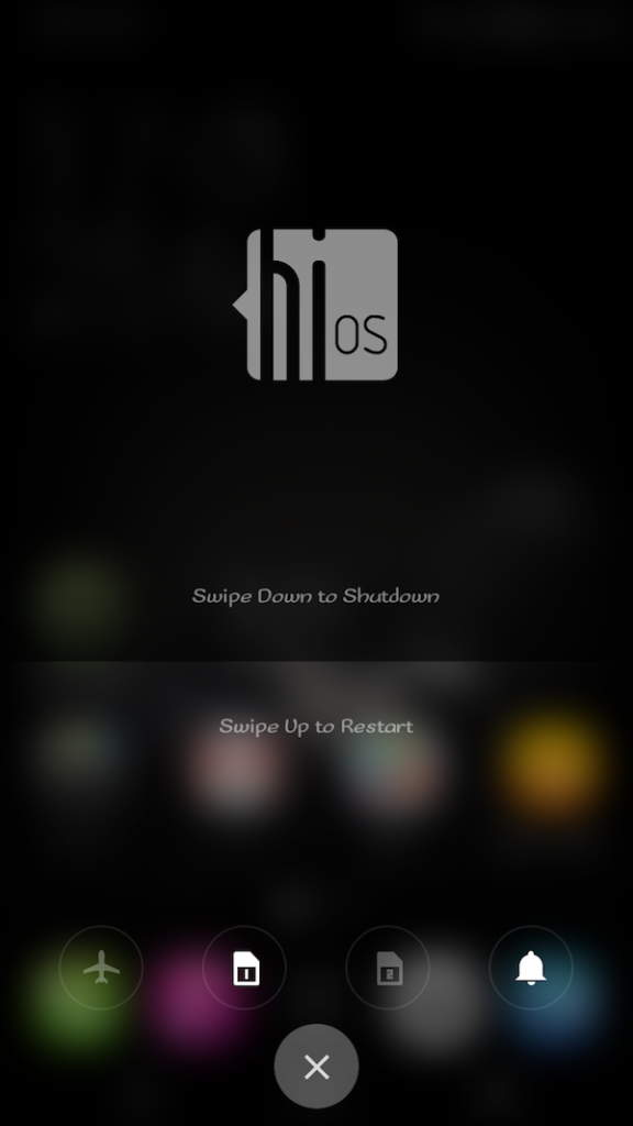
Then this happens when you hold down the power button. I thought it was cool and it definitely is a nice personal touch.
I think it’d be unfair to talk about the Hi-OS without talking about Hi Manager.
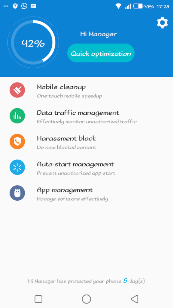
The Hi Manager definitely helps with…managing the phone. You can monitor stuff like data usage, block spam numbers and optimise the RAM.
Performance
With 2GB RAM and a 64-Bit Quadcore processor, I definitely didn’t experience any lag in performance. Although the phone takes its sweet time in coming on or restarting (I mean, I know you’re a TECNO Boom phone, there’s no need for a one-minute display)
What I did experience was a little delay in screen response. Okay, that was me putting it mildly. That “little delay” made using this phone annoying, especially when I was typing. I had to deliberately press the keyboard a lot of times, just so I could send a message. It was frustrating for me cos my thumbs usually fly across the keyboard and I wasn’t getting the output I expected or wanted.
The whole thing just put me off typing – I tweeted less and sent voice notes more. I would love to assume this problem is peculiar to this unit and not the entire batch.
Another problem I encountered was when I was using cellular data. I know network service isn’t great in Nigeria, but using this phone made it seem worse (this is me comparing it to the service I get on my other phone). Wifi worked alright, though.
Calls came in fine too. The sound quality and connectivity weren’t impaired and this is core reason for getting a phone, no? The Boom J8 can make and receive calls efficiently.
Camera
The phone comes with a 13MP rear camera and a 5MP selfie one, but it really isn’t about pixel count. I found that I wasn’t impressed, with the front camera, at least. I know, you can argue that the phone is a music phone and the camera is not meant to impress, but come on…
Both cameras don’t do well indoor/low lighting settings. You might say the fact that both cameras have flash makes everything better, but it does not to me.

The camera focus isn’t that great so the quality isn’t as sharp as you’d expect, and a lot of the pictures I took came out a bit grainy. Basically, you need (lots of) good light to get decent output from the camera.
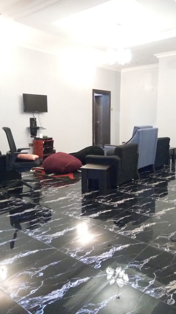
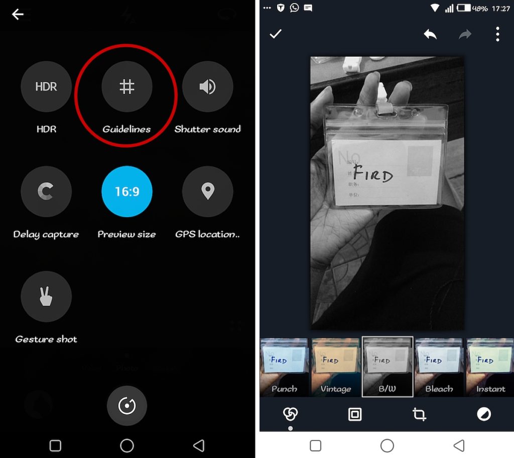
There are not too many camera settings to play with, but at least there are a few filters to be explored in the camera app. Although I didn’t like that applying a filter means you lose the original copy of a picture. It’d have been better if a separate folder was automatically opened for edited pictures, so you can keep the original and do whatever you want with it.
Music
Now, THIS is the reason why we all here. It’s a Boom J8, it’s supposed to have that “boom boom pow” when it comes to music. The main selling points of the phone are the Boom player, the Boom Maxx and the Boom headphones.
Boom Player
The Boom player is supposed to provide a catalogue of music for download and/or streaming (we’ll talk more on this later) but I really was interested in how Tecno would spin its music app. It’s a “music phone” (I still don’t know why we have specialised phones in 2016) so it’s supposed to have a kickass music app. I realised I took music apps for granted when I bought a phone that didn’t come with one – spent months looking for a soulmate on PlayStore, and I definitely expected Tecno to bring some style and functionality to the table.
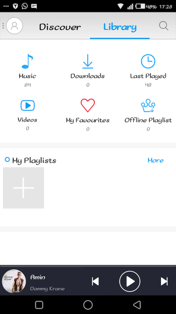
I don’t think they saw the table at all, talk less of bringing anything to the table. The first thing that came to my mind when I opened the Boom player was how much I didn’t like the UI. They obviously didn’t put much effort into the design (and this is not me factoring in my bias against white themes). So this app definitely gets a zero for design from me. It’s simple, yes, but it’s not beautiful. It looks like a prototype; something not quite finished.
Another thing – why is there no “Most Played” or something? This is usually my go-to playlist on any music app. Because I’m too lazy to sit down and create a playlist of my favourite songs, so I want my app figure them out by how many times I play a song.
“Recently added” is another preset playlist I want to see. I know you see “Downloads”, but what if I want to listen to songs I just got regardless of how I got them – from my PC, the internet or bluetooth?
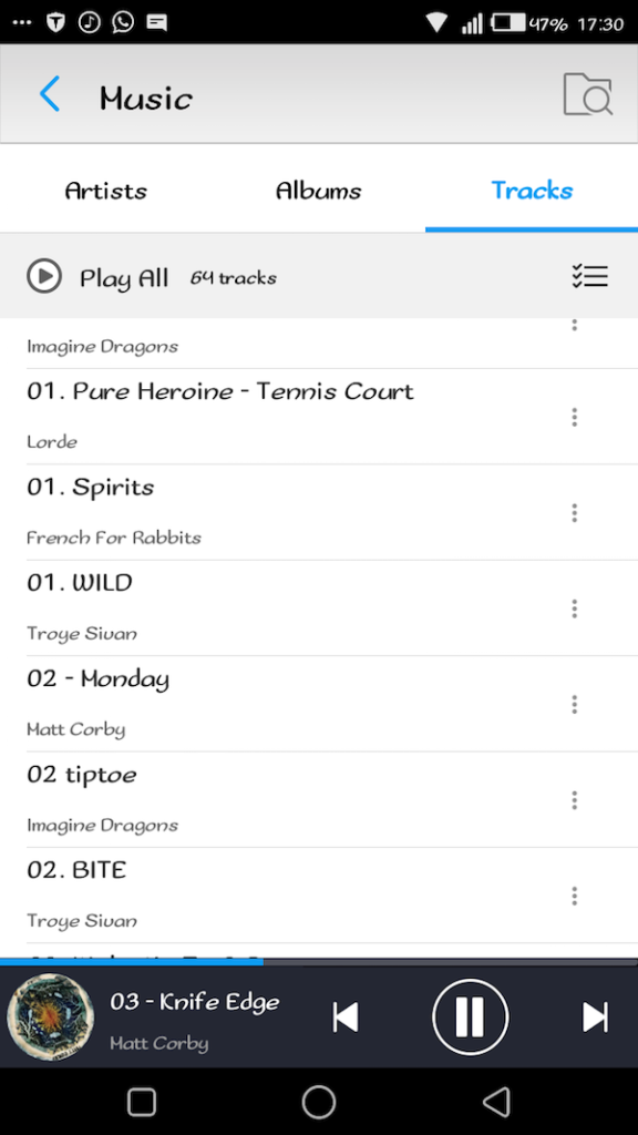
Let’s talk about the naming system/entire arrangement, shall we? Okay guys, file name is different from track title. I do not want to see file names in my songs list. File names are generally not helpful. Guys, please, my songs list is full of track numbers with the names coming in after. I don’t know the track numbers of any of the songs I like. Guys, wyd?
Also, you have to actually scroll to the song you want to listen to. You can’t search for it, you can’t move or jump the scroll bar, you have to scroll through each and every item. I know you see a search icon on the top right of the app, but that’s to “scan local files”. I don’t know why I would want to scan local files, but I can’t speak for everyone out there.
Also, let’s say, for instance, that I feel strongly about this annoying title system thing; enough to dedicate my time and resources into renaming each and every track on my phone, I can’t. Tracks simply cannot be renamed from within the app. The only options that come with a song are “Add to Playlist”, “Set as Ringtone”, and “Delete”. Also, details like file location or size are left out.
It just occurred to me, as I type this, that you can’t even send songs from the app. If you want to send a song, you have to go to File Manager, figure out what folder the song is in, then send it from there. You also have to go to File Manager to rename tracks. Brethren, this player doesn’t even have a lock screen widget. I’m not happy with this player.
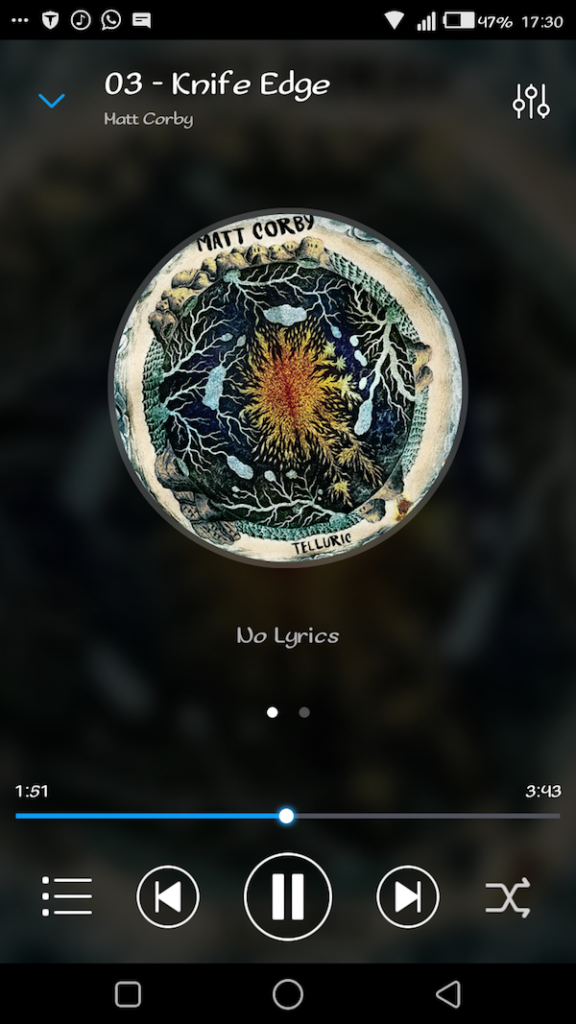
I like this “now playing” screen a little. The album art is fit in a circle that rotates vinyl record-style. But I don’t get the whole “No Lyrics” thing. Am I supposed to go out to look for the lyrics? Are you telling me you can’t find the lyrics to my song? I’m not going to compare this app to MusixMatch, so I’ll just stop here. Let’s go to the “Discover” section.
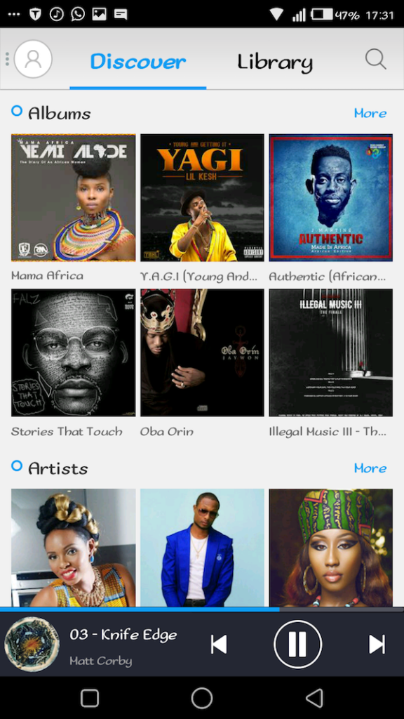
The Discover tab on the Boom player is where you can find songs and videos to download or stream. There are suggestions based on charts, albums, artists, genres and even moods (which is essentially playlists based on…moods). I liked the moods playlists (for obvious reasons) and the fact that the songs in each playlist were relevant is definitely a plus for me. The Tecno team is on to something good with this Discover thing.
I’m going to assume any discovering to be done here is just for Nigerian content. Either that or Tecno hasn’t gotten round to building a database for international music. But even at that, the Discover tab failed my first test – I couldn’t find Wizkid’s Baba Nla. But forget that test, I discovered (haha) Nigerian talent I had never heard of, and reminisced on the few I had forgotten.
I also got a message notifying me of the new Worker’s Day playlist. (I would happily defend the honour of this Tecno moods playlist thing anywhere)
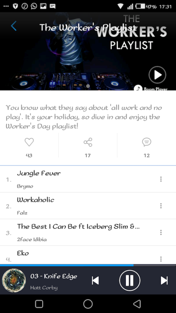
The Discover Tab shows promise and to me, this is the best thing about the phone. Although I don’t know why there’s a radio option in Discover and a separate radio app. And no, it’s not an internet radio that’s in Discover. The only difference is the one in Discover comes with a list of radio stations by city with a brief description of the station. So instead of searching frequencies, you just click on the name of the station you want. Obviously, the radio in Discover >>>> the FM radio app.
Boom Maxx
The Boom Maxx ensures unparalleled professional sound experience. Ladies and gentlemen, the Boom Maxx is an audio equalizer.
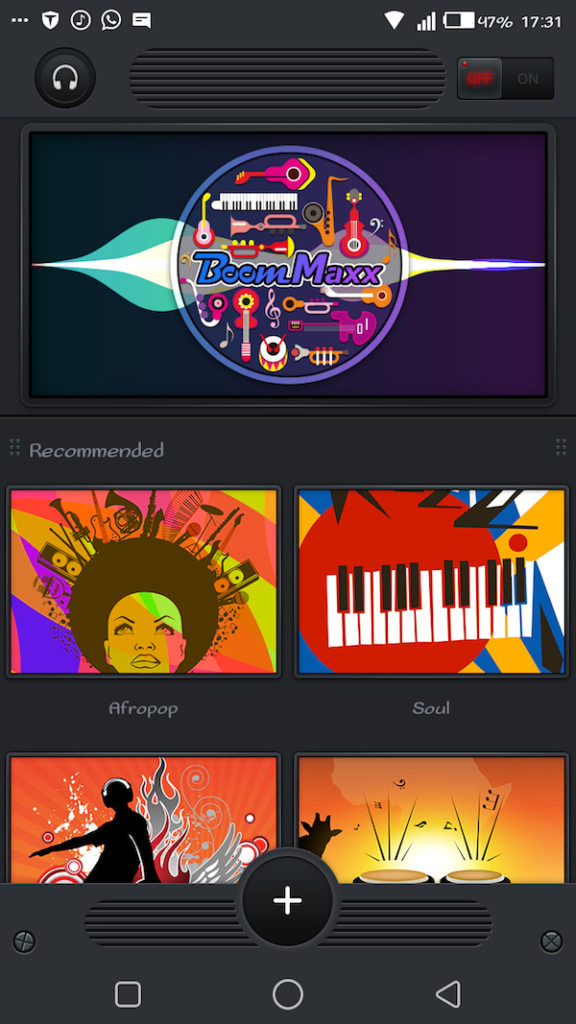
There are preset/recommended settings that can be modified, and you can make and save your own custom settings from scratch.
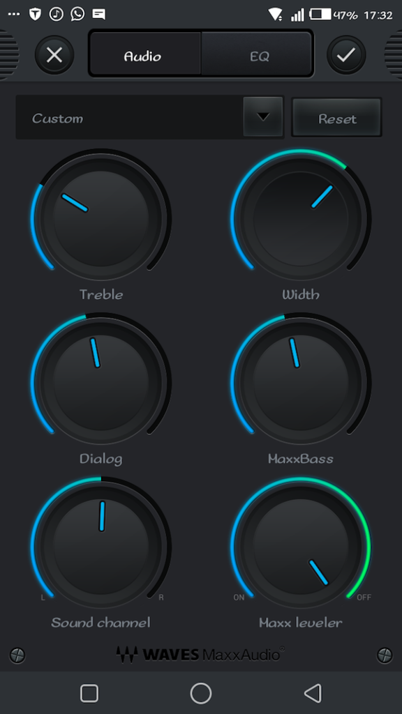
You can also get the best out of your earphones (any at all) by choosing sound settings of four listening devices – Boom headphones, Boom earphones, Beats studio 2.0, and plain, normal earphones.
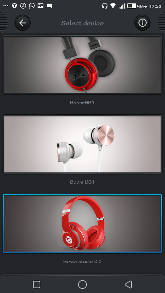
Yes, the Boom Maxx made listening to music (more) enjoyable and it goes without saying that you need head/earphones to really appreciate the Boom Maxx. Again, Tecno is on to something with this one.
Battery
The phone packs an in-built battery of 3000mAh, which is a good idea because any company that wants to sell phones in Africa knows to make a substantial offering in terms of battery. Plus the fact that Tecno expects Boom J8 users to listen to music a lot means battery capacity should be a consideration.
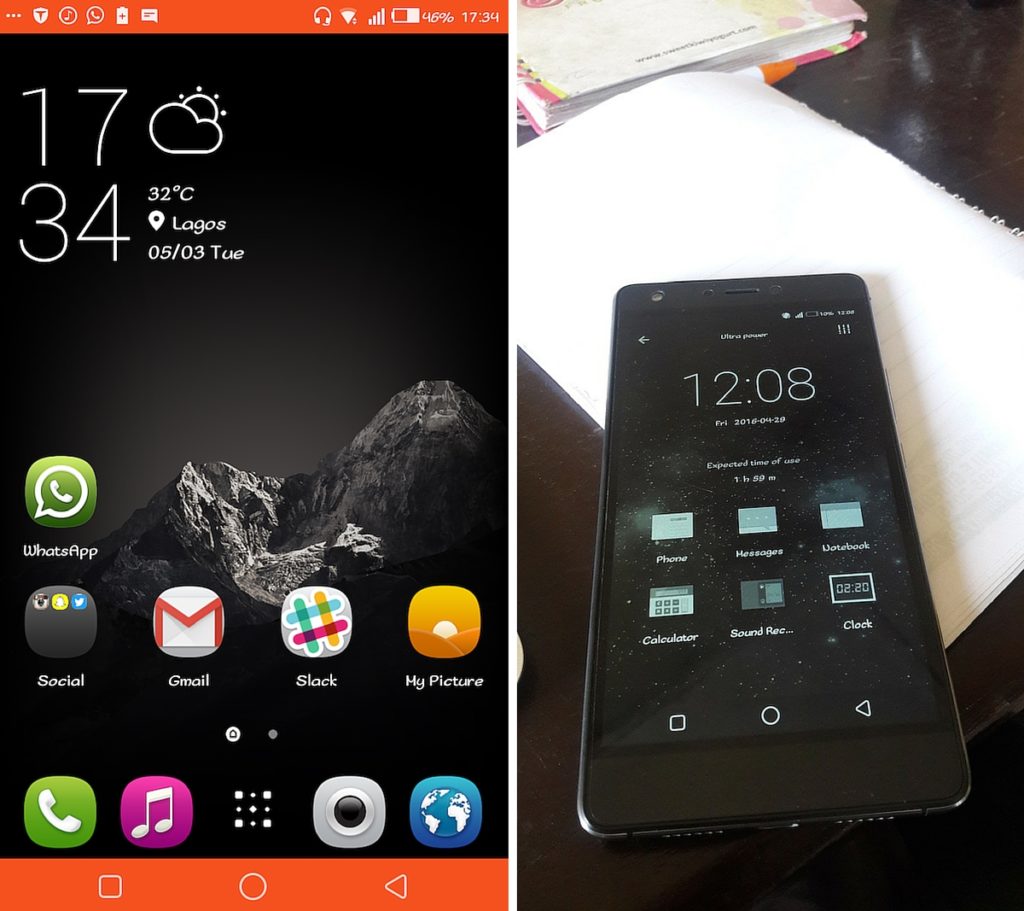
The Boom J8 delivers well on battery front. It took me through a whole day of medium use – social networking, instant messaging and listening to music. There’s a battery saving option that adds orange bars at the top and bottom of the screen and also extends battery life.
There’s also an ultra power saving option that turns the display to black and white, and reduces phone functionality to the barest minimum – can’t even take a screenshot.
Summary
If you read through each and every word I typed in this review, I appreciate you. God knows I tried to say all I wanted to say in as few words as possible. Now, the verdict.
As a successor, the Boom J8 definitely delivers. It’s an improvement on size, camera, RAM, battery, and of course, OS. It also has a better hardware design than its predecessor and it looks better. But you have to bear in mind that it’s also more expensive than the Boom J7 by at least N10,000. Which brings me to my next point.
Does the Boom J8 provide value for money as a standalone device? I’m not sure. I use a mid-range phone that cost N48,000 and I would definitely pick that over this. Nothing particularly impressed me about this device, although I saw a couple of things would’ve made this device pop if only they gave a little more attention to detail.
The thing about having an Android phone is that there are lots of apps that can provide most of the functions you want. How an OEM serves these different functions and enhances user experience is what matters.
I think Tecno should work more on strengthening their selling point, which in this case is music. A better user experience would be nice. If I had to rate this phone, bearing in mind the price and everything, I’d give it a 6 out of 10.


