Do you recall when MTN stripped its logo of all vibrant colours? The Pan-African telecom giant, known for its signature “Y’ello!” greeting, bid farewell to its iconic yellow shade, italics, and red underscore in favour of a solid oval, more minimalist look. Despite the flurry of criticism surrounding the minimalistic rebranding, the company insisted that it reflected a “refreshed strategy.”
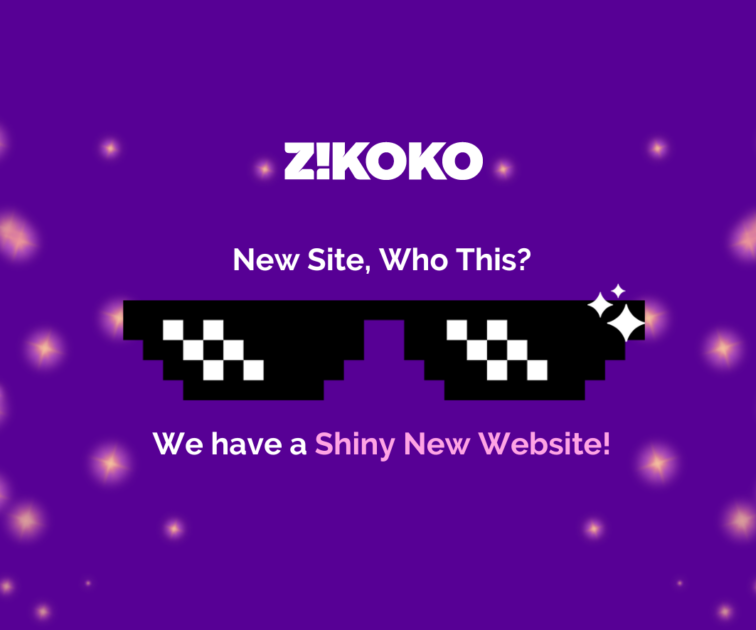
Nigeria-based digital media outlet Zikoko has recently undergone a similar visual transformation, in the form of a major website overhaul.
Personally, I’ve found the new website to be seamless. With its more intuitive interface, navigation to its exhilarating content feels like a breeze. There is now a main menu that features all of Zikoko’s categories, a side menu that provides access to various flagship content, a section for trending articles and a video section called Shows. There’s even a widget that leads to all of Zikoko’s newsletters.
Zikoko, which is owned by Big Cabal Media, has made a name for itself by telling stories about the experiences, perspectives, and humour of African youth through engaging and often hilarious content.
Perhaps most excitingly, the website revamp feels like a reinvention, especially given the recent launch of Zikoko Citizen, a flagship for African youth who are increasingly interested in politics. It’s as if the website has been rebooted to align with contemporary culture—”A new website for a new age.”
I thought you might want to hear about the design process of the website of one of Africa’s biggest youth-focused publications. So I had a chat with the members of BCM’s in-house design team that worked to realise this dream: Tuntamilore Tawak, Barbara Odusola-Stevenson and Osemudiamen Ehiabhi. Here is how our chat went:
Me: What were the first steps you took to execute this project?
Osemudiamen: We had to understand what the business goals were and make sure that they actually aligned with the users’ needs. It is possible for a business to see the problems users are facing from a completely different perspective than the users themselves. Moreover, there is sometimes a clash between business goals and users’ needs. For example, a media company might need to sell a lot more ads, but the users might find the ad placement distracting. So our goal was to find a way to merge both.
Barbara: Yeah, so we did a lot of research. Our audience is very engaging so whenever we sent out surveys, we got hundreds of responses from users telling us what they liked and didn’t like about their experience on the website. We had limited time, so we did a thematic analysis of the diverse responses to find the common pain points and establish a hierarchy of needs. No matter how many grand ideas we had, we had to focus on solving the most important problems for the sake of the business.
The biggest problem was discoverability; there was so much content on the website that even the most active users were missing out on. So that is what we focused on solving.
Me: Aside from the explicit needs of the business, was there a creative inspiration behind the new design?
Osemudiamen: Our mood board was full. The business and users we surveyed recommended the aesthetics of certain websites they enjoyed looking at. We also had ideas of our own, and eventually, we drew inspiration from all over the place and filtered them through Zikoko’s signature vibrant vibe.
Me: How was your experience working with Zikoko? Did you experience any challenges?
Osemudiamen: It was an interesting few months. They are a very creative team, and I am proud of what we were able to achieve together.
Tuntamilore: The most challenging part was the feedback process. During our weekly meetings, it was difficult to get actionable feedback from the editorial team. They were saying a lot about what they liked or disliked, but it was challenging to distil all they said into practical information for adequate implementation.
I let out an ugly laugh on the call. Designers have had an age-long love-hate relationship with their clients centred around this subject of communication. There are hundreds of memes making jokes about the matter. I found it interesting to learn that even the expressive writers of Zikoko weren’t spared from the curse.
Me: So what advice would you give editorial teams or businesses on how to communicate feedback to designers?
Osemudiamen: It really isn’t easy figuring out how to implement “scented candle vibes” in a design, so it would help both sides to be patient and clear in their communication. It’s also important to understand that we’re all on the same side. Sometimes it can feel like designers are in a different world from the others in the business, and that might affect the way feedback is communicated.
Barbara: I think it’s also important for all stakeholders to be at all the meetings so that we do not walk back from decisions and undo the progress we have made because someone who missed the last meeting doesn’t like where the design is headed.
Osemudiamen: That’s right. Meetings are important. Before we began designing, we had tons meetings with different stakeholders in the business, including the tech team, editorial, biz-dev, etc. They all need to provide their input before the design starts and throughout the course of it.
Moments later, I spoke to Ruth Zakari, Zikoko’s managing editor. I told her about the design team’s feeling that the communication could have been better, and she agreed.
Ruth: The work of the design team was absolutely brilliant. But I completely agree that communication was a very hard part of the project. I didn’t realize it would be so mentally taxing to communicate design feedback in a practical way. It all worked out in the end, as they were a very helpful and understanding team. We had a vision, and they pretty much materialised it. Overall, it was an interesting and rewarding process moving from ideation to the final product.
Me: Why was the redesign necessary?
Ruth: The website is attractive, but it was not a vanity project. We had a business goal: our users were having trouble finding the content we published on our site. Zikoko pushes out a lot of content consistently, but when users got to the site, it was hard to navigate to where all the new stuff was and to find old stuff they really liked. On the old website, it was easier to find the most popular things, such as the most popular quizzes, the most popular flagships, etc. The new site makes it easy to find everything, popular or not. It has a better navigation bar and sidebars that show all the flagships that you like.
Me: In general, how important is design to Zikoko?
Ruth: Design conveys all Zikoko’s content—articles, videos, events, and all that we create. It channels our work to our audience with a vibe that truly reflects what we stand for and our sincere desires for our audience.
Me: Now that this design is done, it must feel like a new age for Zikoko. What are the goals Zikoko hopes to achieve in the near future?
Ruth: Zikoko has come a long way. We have evolved and come to a point where our goal is to become as original as possible. We do not want Zikoko to be described as, say, the “Buzzfeed of Africa” or the “Rolling Stone of Africa.” We want Zikoko to just be Zikoko, and we are working towards achieving that goal by covering African stories and publishing African content in our own unique way.


