The first thing a potential customer should see on your site is the answer to the above question.
And most times you have less than 30 seconds to get that across. The only reason this shouldn’t be the case is if your product is designed specifically to waste people’s time.
I’ve landed on a ton of Nigerian online services and asked myself the same question over and over, “what exactly is going on here?”. This is right before I immediately close the tab. The sad thing is some of these guys have real value to offer but alongside that, a huge problem of communicating exactly what.
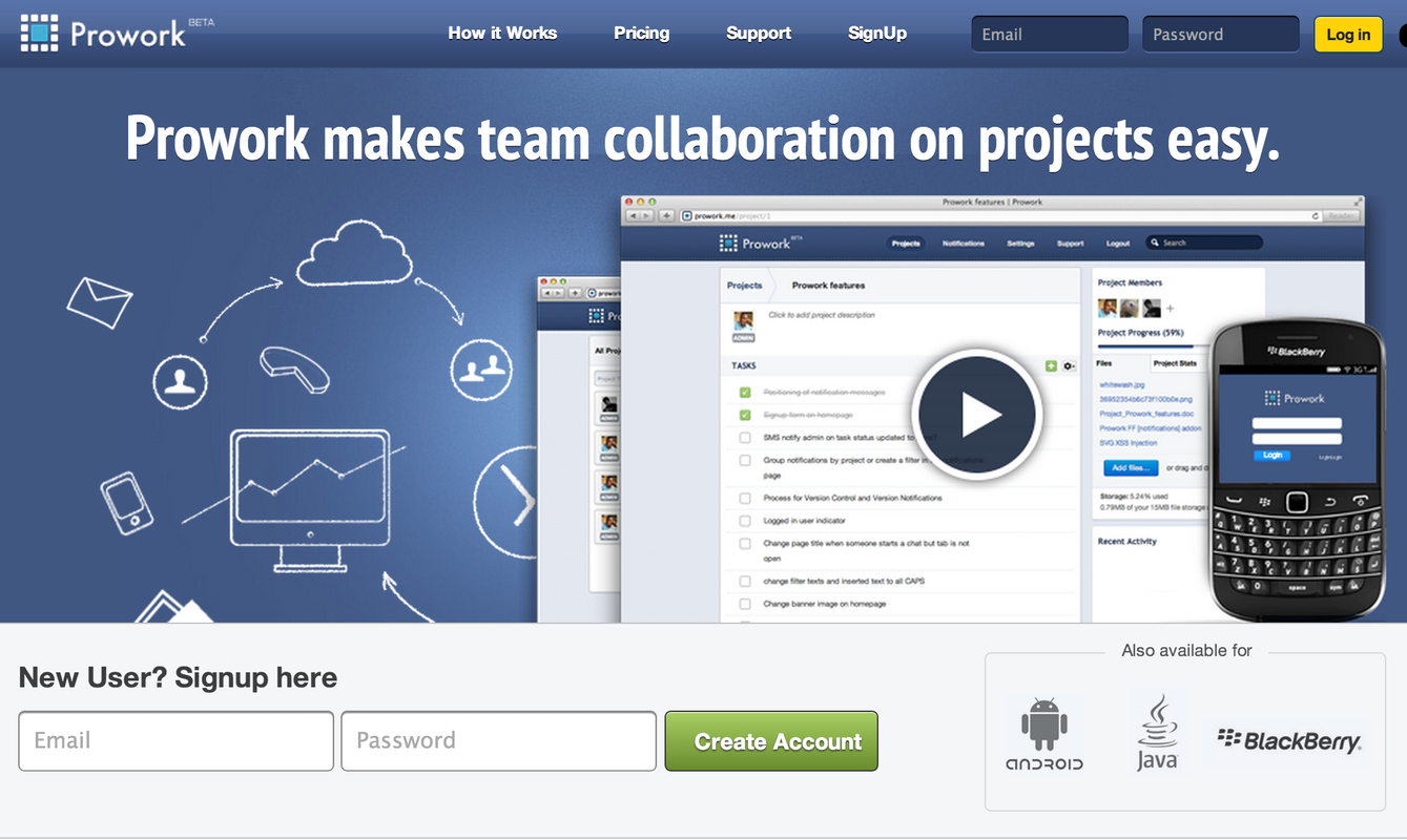
Here is Prowork’s website. One line description and call to action above the fold, as it should be. Good.
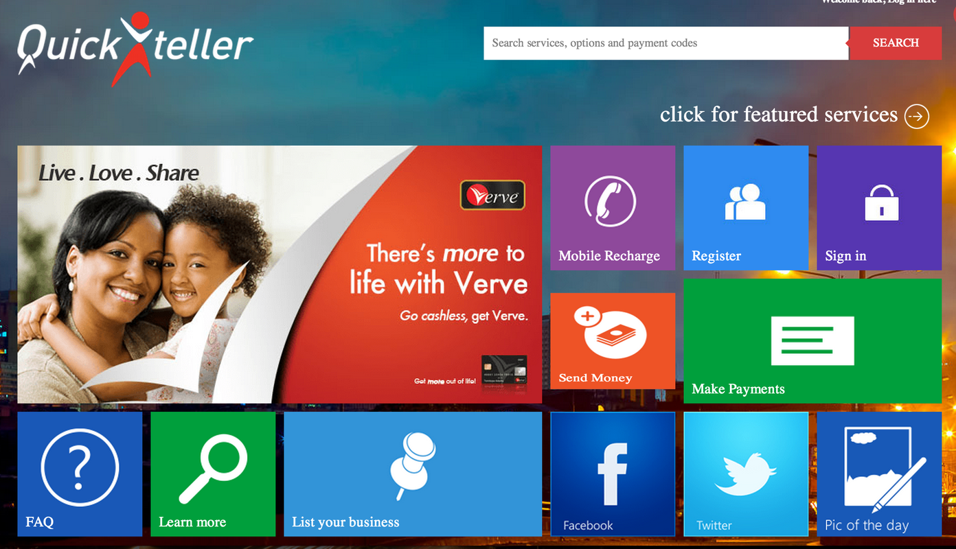
Now here’s Quickteller’s new website.
Seriously, WTF is going on here? I have no idea.
We are in an age where everyone thinks 24 hours is not enough time for a day. There’s so much to be done, so much we are doing and so little done. Nobody gives a rat’s ass about your cute background picture or map or icon or video. At least not until they know you have something they are interested in.
You might want to read about the concept of the attention economy. TL;DR — there’s a lot of money to be made from saving people’s time. When I land on your site, the first thing I want to know is whether I should be here or if I’m better off posting gibberish on twitter. Browser tabs are ridiculously easy to close (Ctrl/Command + W), not to mention that there’s huge incentive to do so these days. If you want to capture a customer’s attention, then you’ve got to communicate what value you have to offer in less time than it takes to reach the ‘x’ button.
This post first appeared on Clive’s Medium.


