A few weeks ago, Tecno Mobile unveiled a new mid-range smartphone, the Boom J8 to much fanfare. They put pair of free (and frankly, forgettable) headphones in the goodybag, and the phone came with a new Tecno-designed UI skin, HiOS pre-installed. I hear users of Tecno’s other offerings like the Camon C8 can now flash their phones and take advantage of what’s intended to be a better user experience, too.
I’ve had the pleasure of interacting with HiOS for a while now, since Tola published her review of the Boom J8 (you should check that out, by the way, if you haven’t) a few days ago, and handed it over to me.
I’m tempted to call for heads in Tecno’s branding department to roll. What I’d like to know first, is where the inspiration for the name HiOS came from in the first place. Because whether you pronounce it like a bewhiskered man from Bodija, Ibadan: /hai O.S./ or you spell it out like a 3-year old Kindergarten pupil: /H.I.O.S/, it still looks like they were riffing off Apple’s mobile operating system, iOS. And that’s a bad look, unless they don’t let a trivial thing like shame get in the way of their nomenclatural greatness. But I’m going to look away for now. So, where do I start?
Right. The beginning. What’s the difference between Santa Claus and an Android update? Ooh, Ooh, I know this one. One is a fairy tale and another is a fat man in a red suit who only works once a year. Seriously, it’s 2016 and we’re preparing for a full roll-out of Android N, yet OEMs are still releasing smartphones based on Android Lollipop 5.1 – a platform that was released 3 versions ago.
Android: For people who like to update their software to the latest version by buying new hardware.
Am I being a pedant? Maybe, but in this part of the world, Android-based phone makers don’t have to jump through all the carrier hoops that their counterparts in US/Japan do, so…wyd?
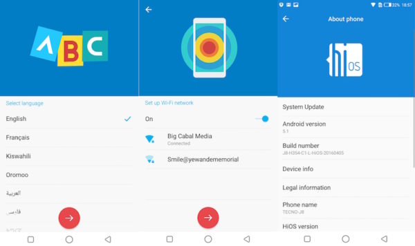
Setting up HiOS was quick work. I selected my preferred language and country, then selected a WiFi network with which to complete the process. As soon as the setup was done, TECNO drew my attention to their Quick Accelerator app to “free up memory”. The icon simply spun with ardour when I tapped on it and magically announced that it’d freed up around 200MB. I’m going to have to take their word for it.
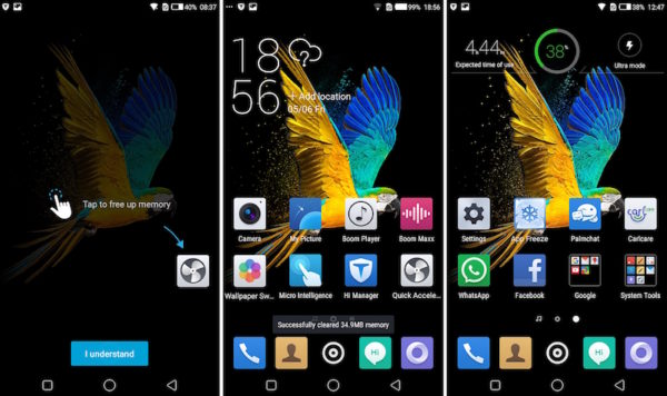
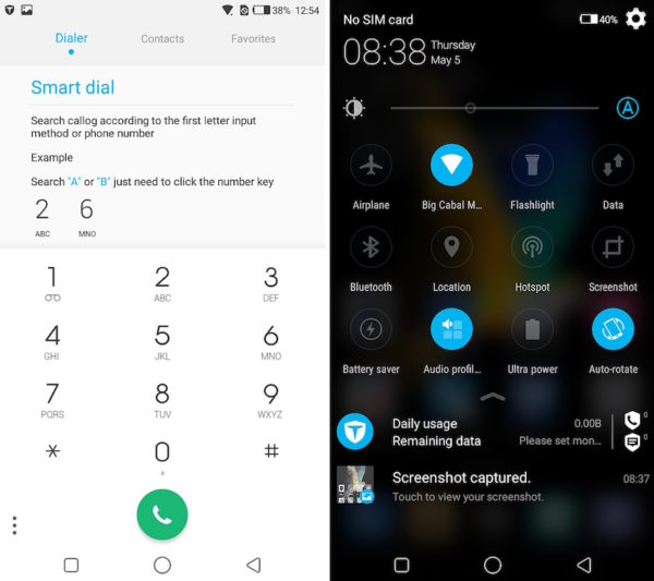
Presumably to bring some granularity to the phone management conversation, there’s an app called Hi Manager right beside the Quick Accelerator. Hi Manager’s got options like Mobile Cleanup, which scans used installation packages, remnant files from uninstalled apps, and random junk taking up space then deletes them to free up ROM.
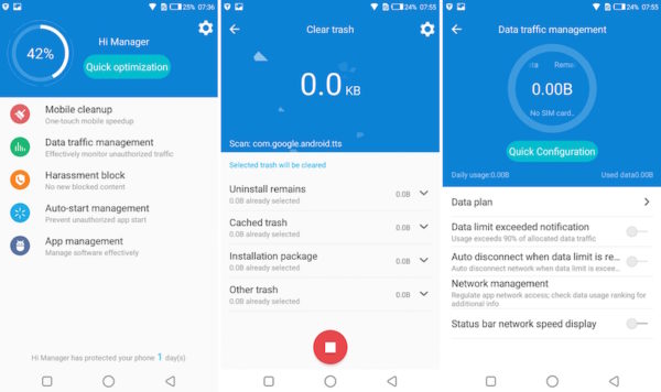
It’s got an option named Data Traffic Management, which – as the name implies – is used to manage your internet data usage. It will come in especially handy to nip those pesky apps in the bud that insist on downloading “updates” every 5 seconds. The Harassment Block is a filter of sorts, to stop certain numbers from contacting you via phone calls or SMS messages. And finally, it’s got an Auto-start management and an App Management app, both of which are there to help you, well…manage apps.
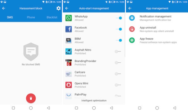
Honestly? There’s no particularly compelling feature in here, or one that cannot be executed from the Settings page of pretty much any Android phone. In fact, at first glance, Hi Manager looks like Tecno’s (hot) take on Infinix’ System Manager, or Blackberry’s DTEK (which I think is an amazing piece of software) – just not as capable, or as good-looking, or as granular.
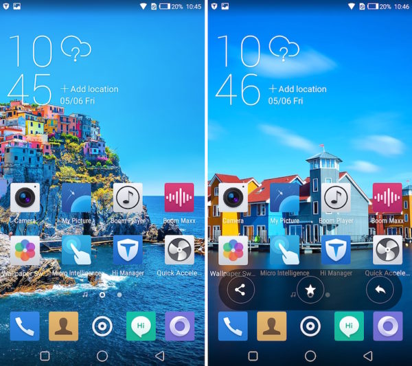
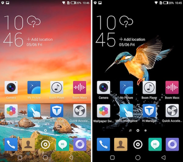
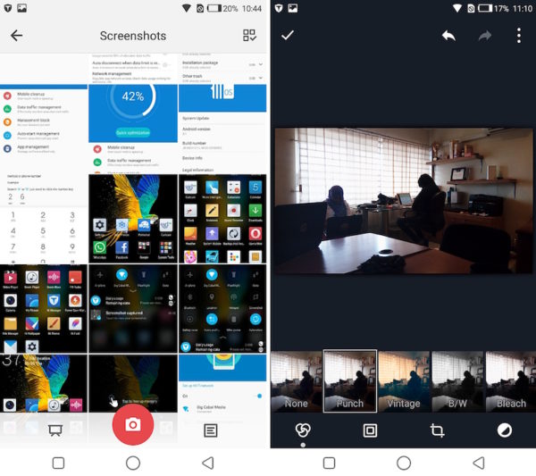
Tecno put in a Wallpaper Switcher icon on the homescreen as well, and by Jove, they have some pretty good looking wallpapers. My Picture is your run-of-the-mill picture manager with a grid-based layout and an accompanying editing…suite.
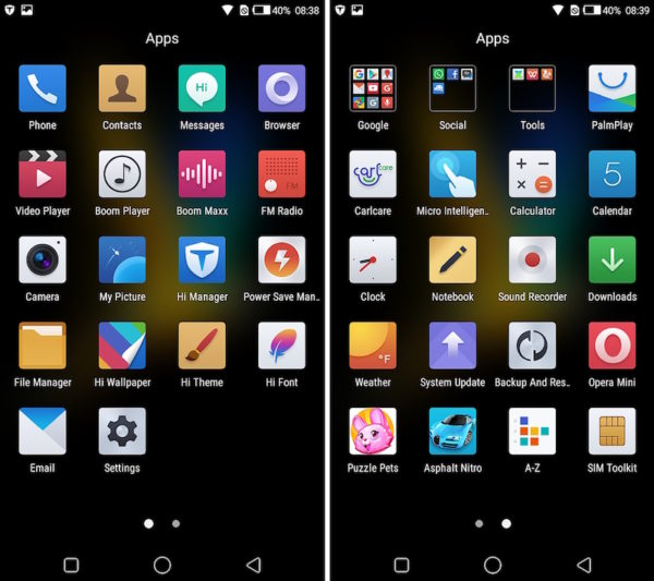
Let’s talk about Tecno’s new icons. Short version? I don’t think they are great. Long version? From the second I tapped on the weird concentric circles that open up the app drawer, I knew I was in for something…special. In an attempt to make them ‘pop’ a bit more, they ended up sending their icons down a rollercoaster ride to Candyland. Add the inconsistent hues, and blatant oversaturation then it starts to look like the icons are going to hug each other to death, smiling as they devolve into a (colorful) oblivion.

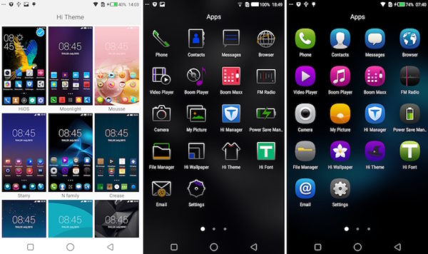
It turns out that if you open the Hi Theme app, you can change the theme, and the icons along with it, but none of the alternatives offer any palliatives. The only one I could tolerate was called Bberry, and it’s a shameless ripoff of legacy Blackberry icons, as you probably already figured out. There’s another called N-Family which steals from Nokia’s Symbian icons from the days of yore, in the same manner.
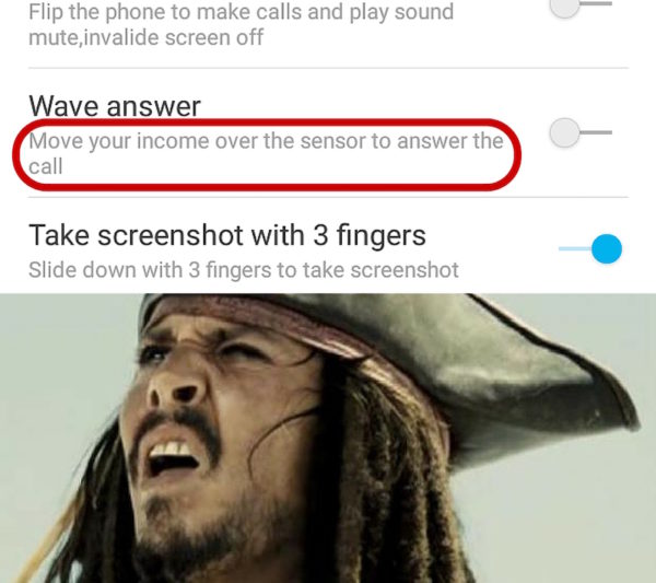
Bad iconography aside, I thought the HiOS could have done with a bit more attention to detail. For example, there’s a Micro Intelligence screen, which contains a bunch of nifty options to give the user experience a little more pizzazz. Thing is, one of the options called Wave Answer, said “Move your income over the sensor to answer the call”. I’m not sure what that one means, but it’s almost like somebody copied all the phone text in Mandarin and dumped it in Google Translate. No other explanation, because I’m not sure how one moves their income to answer a call.
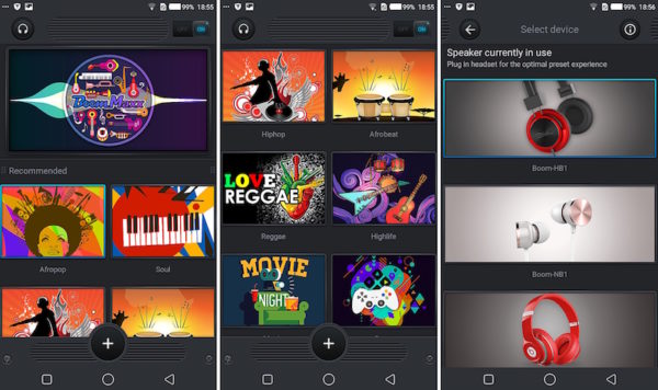
There’s a glorified equalizer with different genre-based presets called Boom Maxx and Tecno’s new streaming service, Boom Player got its own standalone app as well. It’s intended to be a music player for the music you own, as well as a collection of local music available for streaming and downloading.
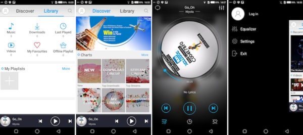
I don’t think it looks bad, but it’s not entirely amazing either. In this case, I’m forced to overlook it since the app runs pretty quickly. In fact, this snappiness is reflected pretty much throughout the user interface. I never once ran into any sluggishness or lag in the few days I interacted with it.
I know, I know, it’s tough in the Android mobile space. Everybody is pricing and speccing themselves to death, so I can understand the rationale behind manufacturers trying to create a unique, consistent feel across their own devices. All I ask is that they either provide a better experience for the end user in the process – form AND function.
The problem is, Tecno’s HiOS is like an angry porcupine. There’s a nasty exterior getting in the way of tender, delicious innards. Their attempts at “form” hindered me from appreciating a very well functioning Android base, and that’s just tragic.
My greatest peeve with UI skins is that they usually end up slowing the phones down without doing much for them aesthetically. While Tecno’s effort, HiOS runs really smoothly – smoother than many I’ve used – I don’t feel right giving them brownie points for not detracting from the experience when it’s their job to improve it.
Wait fess. Is it just me, or does HiOS not have lock screen notifications? Ah. In 2016? No comment.


