As financial services companies evolve, they often fragment into complex webs of licenses and operational territories. This was the reality facing Ceviant. Operating across the UK and Nigeria with distinct arms in treasury management, payments, and asset management, the company faced a unique paradox: they needed to present a unified front to the market while satisfying regulators who demanded strict legal separation between their entities.
The challenge was not merely aesthetic; it was structural. If the brands looked too similar, it implied a shared liability that regulators prohibited. If they looked too distinct, the company lost the brand equity of its ecosystem.
FourthCanvas, the Lagos-based brand design consultancy known for its strategic work with Piggyvest, Ventures Platform, Nomba and Raenest, was tasked with solving this high-stakes puzzle. The brief was deceptively simple but technically complex: create a brand where the units have an obvious connection but are never fused.
Before the rebrand, Ceviant’s architecture was a mouthful, cluttered with descriptors like “Ceviant Finance Nigeria” and “Ceviant Payments Nigeria.” The confusion was internal as well as external.
“The number one problem was regulatory limitations,” explains Victor Fatanmi, who led the strategy at FourthCanvas. “These entities have different licenses and are prohibited from being under the same company. So the question became: How can they feel as one, even when they can’t be?”
FourthCanvas began by stripping away the complexity through a strategic nomenclature audit. The team simplified the naming convention, turning “Ceviant Finance Nigeria” into the sleek Ceviant Finance, and the payment arm into Ceviant Pay. A new cross-border solution was christened Ceviant X, while the investment arm became Ceviant Asset.
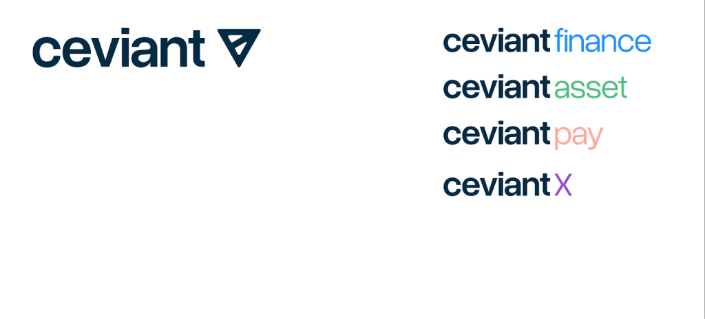
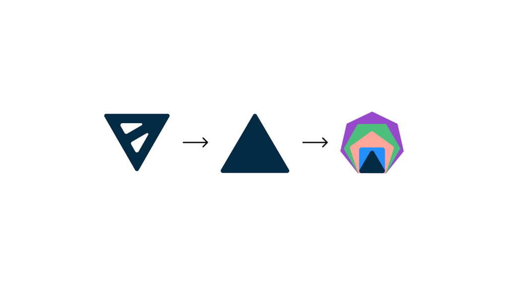
With the names streamlined, the design team had to encode the governance model into the visual form. To navigate the “Connected. Never fused” mandate, FourthCanvas rejected the idea of creating entirely new logos for each entity. Instead, they built a “universe of expression” anchored by a shared visual backbone—the triangle found in the original Ceviant logo.
The design strategy was rooted in the geometric truth that polygons are constructed from triangles. FourthCanvas expanded this “triangular DNA” into a comprehensive polygon system. By treating the triangle as the fundamental building block, they ensured that every subsequent shape was structurally derived from the parent identity while telling a specific story about the sub-brand it represented:
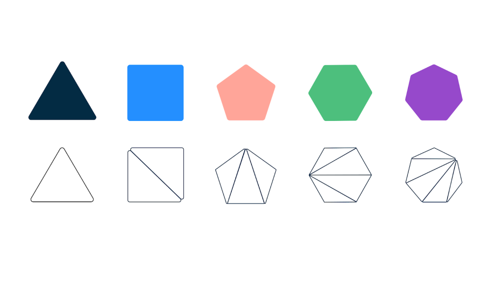
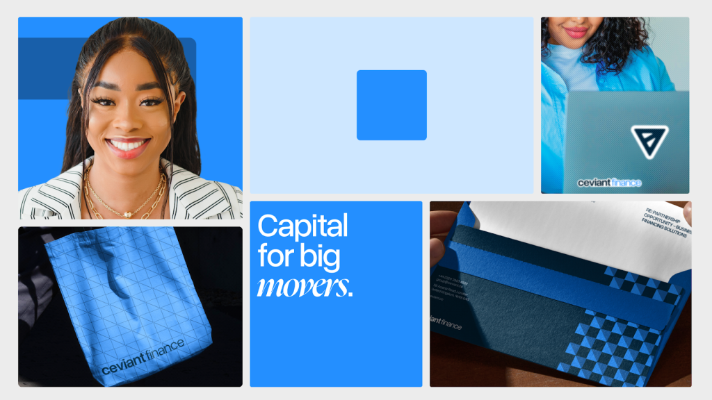
- Ceviant Finance (The Square): As the foundational entity, it retains the core stability of the triangle, representing the balance required in treasury management.
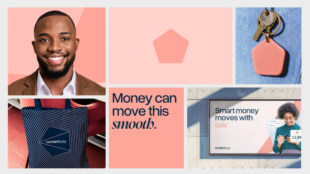
- Ceviant Pay (The Pentagon): Chosen for its association with perimeters and protection, symbolising the multi-layered security required in payments.
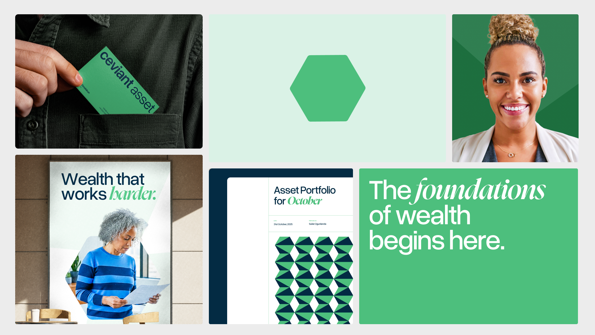
- Ceviant Asset (The Hexagon): Evoking chemical bonds and structural integrity, signalling the move from risky investment to secure, compounded assets.
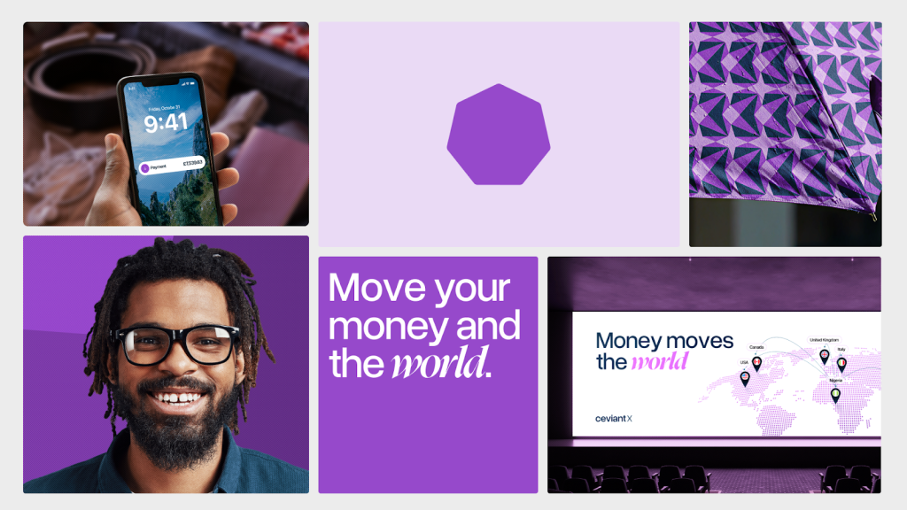
- Ceviant X (The Heptagon): As the polygon with the most sides in the system, it represents the multiple borders, locations, and currencies inherent in cross-border FX solutions.
“This was our attempt to encode Ceviant’s governance model in visual form,” notes Fatanmi. “We made the regulatory-compliant structure legible through design.”
Beyond the logo system, the visual identity needed to straddle two worlds: the agility of a fintech and the gravitas of a traditional financial institution. FourthCanvas achieved this through a deliberate typographic pairing. They combined Overused Grotesk, a modern sans-serif, with Nyght Serif, an institutional serif typeface. The combination allowed Ceviant to speak to a diverse customer base, striking a balance between innovation and established trust.
The result is a generative brand system that solves the regulatory paradox. Each sub-brand—Finance, Pay, Asset, and X—possesses the visual autonomy to function as a distinct legal entity with its own colour story and geometric signature. Yet, through the shared “backbone” of the master logo and colour system, they remain tethered to the ecosystem.
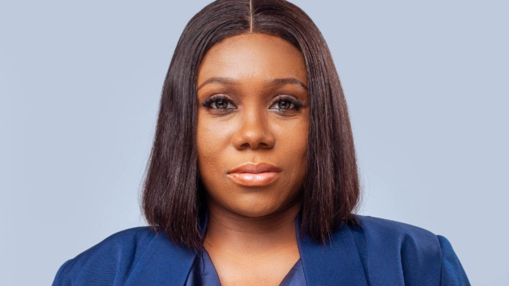
Gbenga Omolokun, Chief Executive Officer of Ceviant, described the engagement as transformative: “Working with FourthCanvas was a truly seamless and collaborative experience. They approached our brand refresh with clarity, curiosity, and a genuine partner mindset—challenging us thoughtfully while remaining aligned with our vision. FourthCanvas didn’t just deliver design; they helped refine and amplify our story.”
Read the full project case study here