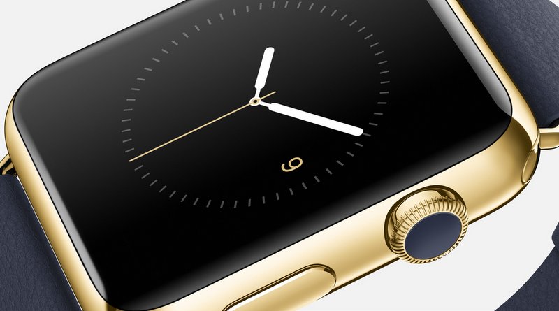
So Apple’s foray into wearable computers has begun, with the unveiling of the Apple Watch. Surprisingly, it wasn’t christened the iWatch like most of us expected. Though a bit inconsistent with their nomenclature, it okay. Using the ‘i’ prefix has almost run its course anyway.
Until now, I have not given smartwatches much thought or attention. This is because they don’t do anything that a smartphone cannot already do (and do better). It was its circular icon grid and digital crown that caught my attention. But before I get to that, let’s extol its virtues.
The good
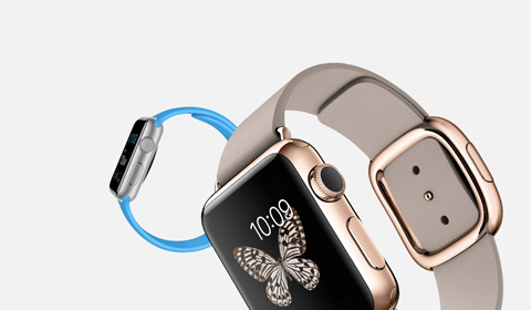
The watch is certainly a good looking piece, although it would be unfair to compare it (or any other smartwatch) to traditional timepieces from the likes of Chopard and Patek Philippe. It features interchangeable straps that to a large extent, change the look of the watch. The straps come in different materials ranging from leather, plastic-resin, aluminium, mesh-bracelets. Some of the straps also feature magnetic clasps in place of the traditional buckle and pin.

The watch also debuts Apple Pay; an NFC payment system that works in conjunction with the iPhone 6 and 6 Plus.
I am unable to say comment on how the watch feels on the wrist because I did not attend the event.
The bad and the ugly
The user interface (UI) has some major flaws.
Being an Apple product, anyone familiar with iPhones, iPads and iPods should know how to use this watch from the get-go. But you would be wrong. This is an Apple mobile device unlike any other. Any similarity it bears with iPhones and the like lie only on the surface. As this video shows, the UI is unintuitive and convoluted. It comprises of taps, swipes, long presses and pushes. While there is absolutely nothing wrong with having all these navigation methods present in one product/UI, they should be employed in a cohesive fashion.
The video also shows that customizing the watch face is a challenge. Apple could have done much better by just allowing the customization to be done on the phone instead.
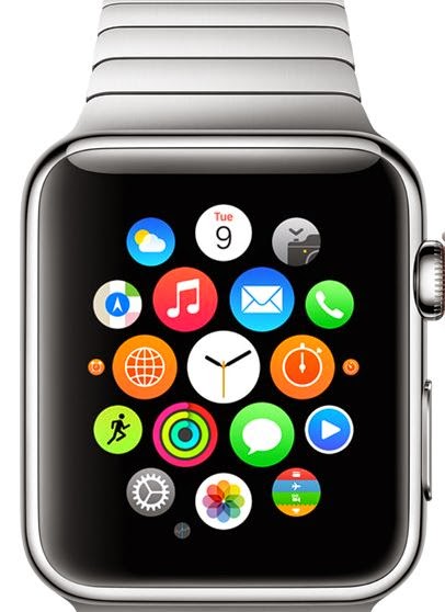
The circular icon grid is also not a good implementation. While it certainly looks elegant when not being used, moving around with it reveals its flaws.
You use what Apple calls the digital crown to navigate the grid. When you zoom out to reveal the bird’s-eye view of all app icons, some of the icons become too tiny to identify and as a result, you would have to know the quadrant in which the icon you need is in. Over time, as more apps are installed, this would present an extreme test on the user’s memory. Eventually, users will have no option but to zoom in and out of every quadrant to locate the icon they are searching for.
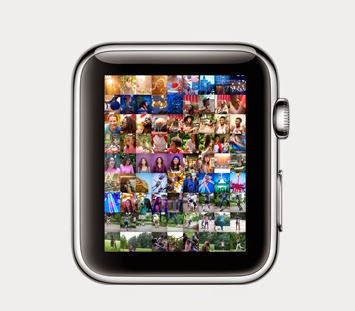
This exact problem is also evident in the photo gallery. Most smartphone users have hundreds of photos and images on the phones. Searching for an exact photo or image in the bird’s-eye view will be certainly end up frustrating many users. You’ll be better off just using your phone instead. The presence of Siri should help alleviate this potential problem a bit.

Apple also managed to make a mess of the naming convention for the three different versions of the Watch: Watch, Watch Sport and Watch Edition. What is the difference between Watch and Watch Edition? Imagine the confusion at the Apple stores when a buyer says he wants the Watch and he is given the Watch Edition instead. This scenario could also play out in reverse. This is a duh moment for Apple and its marketing department.
The Watch also acts as a viewfinder for the iPhone camera. I cannot think of of how this would ever be useful. However, I’m positive that the likes of the chubby kid from the Tom Hanks and Daryl Hannah movie, Splash, would find this very useful. Voyeurs might also find it a godsend.
It also does odd tidbits like sending your heartbeat to fellow Apple Watch wearers. This appears to have no real use. However, since the watch is constantly monitoring heart rate, pulse and other vital signs, a better use will be for it to automatically forward your name and location to emergency services and contacts if your heart rate get dangerously close to cardiac arrest levels. Unfortunately, Apple has made no mention of such a feature.
As with all things Apple, the watch works only with Apple products. In this case, iPhone 5 and newer. No mention was made of iPads and iPods. This is a shame though. There is no reason why it shouldn’t.
As for the digital crown, it turns out to be a mouse click-wheel of sorts. Depending on your use case, this may or may not be a good thing.
So how does the Apple Watch fare in the smartwatch game? It gets points for its styling. But so does the Moto 360 from Motorola. Does it make a compelling case for smartwatches and wearables? I’m afraid it doesn’t.
That being said, I’m glad Apple got with the program and used 1080p on the iPhone 6 Plus in place of their unconventional screen resolutions. They should do the same for all their other mobile products.
Also, watching the official intro video again, the accompanying instrumental has elements of Dr. Dre’s signature sound. I could be wrong but it does sound like a reworked version of one of his previous tunes. If it’s him, I guess he really is working for Apple.