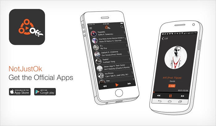
NotJustOk.com is unarguably the biggest online repository of Nigerian music. The web-based service recently went mobile with the launch of their new app available for Android and iOS. Here’s my take on the Android version of the Notjustok app.
The User Interface
The Notjustok app won’t win any awards for “most stunning UI” but, I must say it’s quite pleasing to the eye. I am particularly impressed by the somewhat minimalist design. I do however feel like they could have used a few UI elements consistent with the notjustok web version. Well, at least they endeavoured to use the same colour scheme. That’s just by the way.
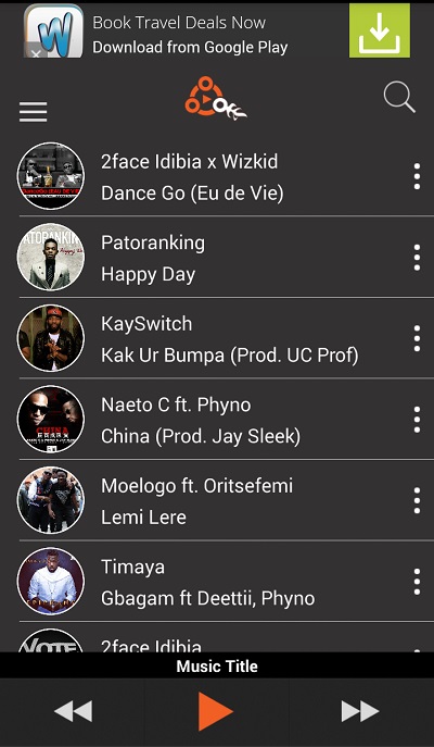
The UI is apparently optimised to aid discovery – the homescreen is simply a list of latest tracks adjoined by basic play controls (previous, play/pause and next) and a search button.
Once can’t help but notice the conspicuous ad banners at the top. That’s my only real gripe with the UI.
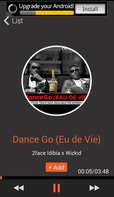
When you click to play a track, you’re presented with a very simple interface that contains nothing more than album art, basic play controls and a button to add the current track to a playlist.
Again, the annoying ad banners. If it weren’t for them, the UI would be absolutely clutter free.
The User Experience
It appears a good deal of thought was put into the User Experience of this Notjustokapp. The average Nigerian music listener is a singles person. They are not particular concerned about albums or specific artistes. It’s more about hit tracks. The Notjustok app has been so designed to deliver this singles-focused experience to the user.
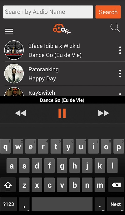
Tracks are presented in a list form, in decreasing chronological order of release. You have the option to listen to tracks from the home list or use the search function to find specifics, preferably by track name. You can always go back to browse the list, or search for another track, while the current song plays in the background.
There’s no provision for grouping tracks by artiste, albums or genre. None of that conventional stuff. However, if you discover a track you would like to listen to over and over again, you can simply add it to user-curated playlists.
The Music
The Notjustok app music library contains strictly Nigerian songs (obviously). You will easily find any and every single that is available on the Notjustok music database. Don’t expect to find album tracks or full albums though.
For metadata freaks like myself, most of the songs include just enough metadata to aid the intended user experience – the album art, track and artiste(s) name(s). Dazall. However, while every song has a track name, you might often find songs without album art. I’m not sure how long I can live with that.
Music streaming is as smooth as you would expect if you were playing tracks on the Notjustok website. Especially if you are on 3G or Wi-Fi.
The Verdict
Simplified as it is, the Notjustok app still needs a lot of work, particularly in the UX department. Every decent music app should at least have
- Quick access from lockscreen and/or notification pull down.
- Current track info and play control widgets on lockscreen.
The Notjustok app has neither of these. I don’t imagine that would reflect positively on user engagement levels. They need to fix it asap.
It’s probably wishful thinking but, I also feel like it’d be a great idea if they allowed offline listening. They already do so on the website, I don’t see why it can’t be possible on the app. It doesn’t matter if they have to pull some crazy DRM stunt to make it work, as long as offline listening is possible.
In all, I am a bit impressed with the Notjustok app, particularly for the commendable attempt at UI and UX, not so much for the music collection. I can see how someone who is crazy about listening to all the latest Nigerian singles will find this app useful for “on-the-go”purposes. That person is just not me.
My sentiments about the music collection aside, it’s a really well-built app. But it still needs a lot more work. For now, it’s just okay.


