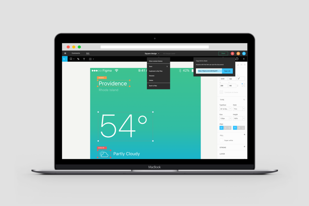
I didn’t think anything could top Canva. Democratising design by making it cheap and bringing it to the web. I thought Canva had done it. We love Canva so much that it’s at the top of our list of design alternatives to Photoshop.
Then these guys come along.
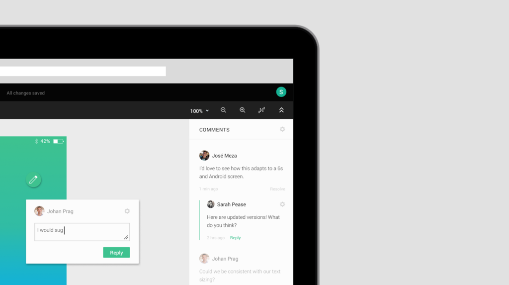
After three years of silence and hard work, I finally get to announce the launch of Figma, a collaborative interface design tool.
Three years. That’s how long Dylan Fields has been working on Figma, with Evan Wallace. Dylan bagged a Thiel Fellowship in 2012, a $100,000 grant that requires you to forgo college to pursue an innovative idea. Together, they started a company in 2012 to see if they could build advanced and collaborative creative tools that live in a browser.
After all that time, these are the results. I have to say, I’m blown away.
When we started working on Figma, we knew it was possible to build a fast and stable graphics tool in the browser, but we had no idea how hard it would be. From vector rendering to font layout to a million performance edge cases, getting here hasn’t been easy. Designers have high expectations for a tool they rely on every day! After dogfooding Figma internally for the past eighteen months and working closely with alpha customers, I’m confident we’ve reached this high bar.
I just signed up, but got put on the waitlist. Hope it comes to my turn quick so I can try it out. And it’s integrated with Slack? Oh boy! Speaking of Slack, this takes me back to that time in 2013 when Slack was in beta and I was one of the first to signup. That feeling when you know this is a product you would gladly pay for because it changes everything about what you used to do. I’m getting that feeling again.
Watch the video, and tell me that’s not impressive. Let’s continue the discussion on Radar.


