By Victor Fatanmi and Mary Afolabi
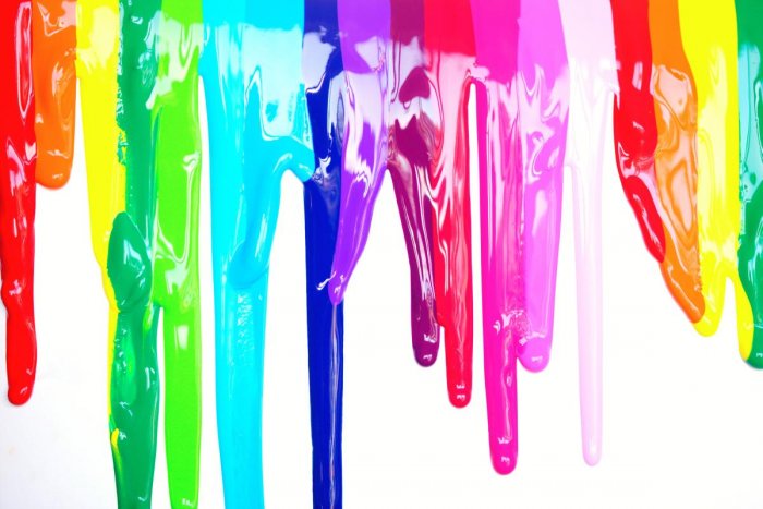
We don’t talk enough about the role of colours in our lives, but it’s right there deeply influencing our behaviours and emotions every single day. From nature’s charm to skin complexions and brands that got it right, we are influenced in different ways by different colours that make us feel in some way, whether we know it or not. On “brands that got it right”, here is our list of 10 outstanding examples we can all relate to across the streets of African nations. We ensured to not pick more than one brand for the same colour or combination. Hence we had to debate the spot on some colours.
1. Zenith: Red

Coca-Cola should be taking the red slot, no matter how you look at it, right Well, while that would be the obvious right answer, there is a story about Zenith Bank’s red that you do not know about. Based on Jim Ovia’s Book, Africa Rise And Shine, the story of choosing red in 1990 when they launched is a remarkable one that redefined the perception of the entire banking sector in Nigeria. According to him, no one, not any of the older banks, ever contemplated the red colour for a financial institution but they decided to take such a bold step to stand and make a statement about their approach to banking. It did not only pay off for them but also became something that a few other banks, like UBA and Sterling would find easy to adopt, many years after.
2. Dstv: Blue

Dstv took what was always their blue brand colour to their ubiquitous dishes that dot the skies of many neighbourhoods across the continent and suddenly it’s blue dishes everywhere unlike anyone saw coming. Satellite dishes of all brands—Dstv or not—usually came in white and no one thought that needed to change but with
the blue colour, they are gaining more recognition and distinction, so much that they earn an undisputable spot in the minds of people, and on this list. Apologies to Chelsea FC merchandise.
3. Mpesa: Green

Africa’s largest mobile money platform has been able to put a firm foot down on the streets of Kenya, its headquarters, with its unmistakable green-clad shops and kiosks. Now with a presence in 6 other countries, including Ghana and Egypt, it is increasingly spreading its green prints across the sub-Saharan and desert itself. Although quality control is understandably difficult with the independence model of the agents and that means different shades of green, they have still been able to achieve an identifiable language with colour and achieve consistency with the nature of the painting—almost 100%, no styling with white or metal or wood. Every shop seems bathed in a drum of green. Finding the closest Mpesa to you will be the least of a task.
4. Shoprite: Red and Yellow

There are two different ways to go home from shopping in Africa. You could be carrying some random white or black polythene bags which could be from any of thousands of supermarket brands no one can tell or it could be the distinctive yellow bags that scream SHOPRITE even before anyone can read the bold red SHOPRITE on it. Starting with this and also extending to their ads, store signages, and more, the Shoprite brand is a great example of brand colour usage for distinction.
5. MTN: Yellow

Although they slightly refreshed the identity and replaced the legendary deep yellow with a slightly brighter one, MTN has successfully deployed colour as a brand tool, “everywhere you go”. If you see a building painted in yellow, or a yellow t-shirt even with nothing printed on it, you are still very likely to think of MTN first.
6. Coldstone: Brick Red

Red is one of the most used colours in brand marketing, and while Zenith Bank already picked up the slot for that on this list, Coldstone has been able to carve out and stick to a brick-like shade of it and it has seamlessly become a part of their “rich-taste” brand. From the ads to the buildings and cups, they have successfully made it theirs in an unmistakable way, especially with a brilliant combination with some unique visual elements.
7. Mobile: Green, lemon and black

Before Etisalat—the brand that became 9Mobile in Nigeria but with the identity system retained—broke into the Nigerian telecoms industry, the existing players had maintained systems based on one primary colour; yellow for MTN, red for
Airtel, and green for glo. Etisalat brought a new twist, with a beautiful combination of three primary colours—green, lemon, and black, while still being clearly distinctive. 9Mobile has carried on with this theme and it retains its place as a top example of a brand colour system.
This is way too subjective for us to be able to defend the “Top 8” claim in court but clearly, you will agree that these are some of the top examples out there, as brands attempt to maximize colour, among other elements, to stand out and earn a place in the minds of people.
While some of these choices may seem like random choices that turned outright, we can confirm, thanks to insider information (smiles), that these brands commit a lot of resources and intentionality to arrive at these colour decisions, because they understand the implications, as well as that of other components of the brand.