


There is no doubt that every 21st century (online) business needs to have a mobile presence. Mobile is evidently taking over the world and it would be foolhardy for any serious business to ignore the facts.
There are over 4.9 billion active internet users worldwide, over 70% of which access it through their mobile. That figure is projected to leap to about 90% by 2017.
In Africa, most internet users access the internet not just on mobile first, for most the internet is mobile-only.
Mobile First?
One of the more tossed around buzz-phrases these days in UX design is “mobile first”. The philosophy behind mobile first is that it is more beneficial to design your experience for mobile first and then expand to other devices, like the PC. The most obvious benefit of this approach is that, as stated earlier, majority of your target audience accesses the internet on mobile.
Also, by limiting design and development to a primarily mobile experience, on is forced to focus on the really important features and elements, giving the users what they really need. Finally, it is so much more easier to upscale from mobile to PC, than down-scaling from PC to mobile. As ‘Nomadic Web/UX Designer’ Clarissa Peterson puts it:
Think of it like you’re moving. If you’re living in a mansion and you have to move into a small apartment, it’s really hard to find a place for all of your stuff. If you live in a small apartment first, you learn how to get by with less stuff, and you can then add more stuff when you move into a mansion.
The Dimensions to Mobile Presence
I like to think there are 3 dimensions to mobile presence – Mobile websites, Responsive websites and Mobile apps. Yes, mobile and responsive websites are two different things. Think goal.com on mobile vs bellanaija.com on mobile. The later is responsive while the former is “mobilized”.
Goal.com on the web
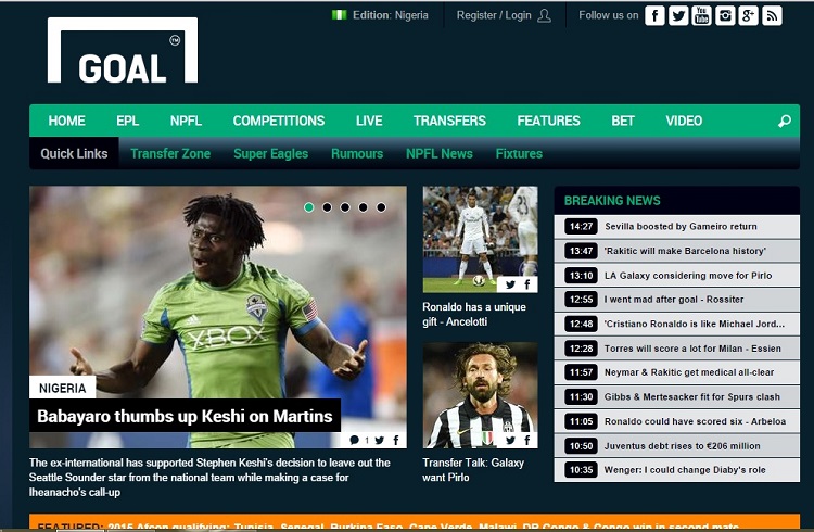
Goal.com on mobile

BellaNaija on the web

BellaNaija on mobile

A mobile website ( like m.goal.com) is built from scratch, separately from the main website (goal.com), with mobile only in mind. On the other hand, a responsive website is built with mobile first in mind, so that certain elements are rearranged, hidden, contracted or expanded, in adaptation to the device screen size.
Then we have mobile apps. Mobiles apps the advantage of being cross-platform, giving a native experience to the user regardless of the platform they are on.
Choosing your mobile strategy
For business that want to take their mobile presence seriously, one of the biggest decisions they will have to make is whether to take the app or mobile site route.
Responsive websites are the cheapest and easiest to maintain, depending on the level of complexity. For most businesses, barrier to entry is usually nothing much more than a $50 budget to acquire a neat responsive WordPress theme on Themeforest.
However, if you are looking for a bit more utility and functionality, you have to consider other options. Building an entirely different mobile-optimized version of the site from scratch is one of these options. This allows you to take better control of the User Experience by including mobile-specific functionalities that utilize mobile technologies like GPS location, camera, audio/video, multi-touch gestures and telephony.
Mobile sites have the advantage of being accessible from any device, regardless of the platform. But they do come with disadvantages, the most obvious being that it costs more to build and maintain a mobile site, as opposed to a responsive website. They are also an SEO nightmare, due to the requirements for multiple URLs and redirects.
The third option is to build a native mobile app. Aside from the fact they take your business tons of notches up on the cool-meter, mobile apps are like the be all and end all of mobile user experience. However, if you are going to build an app, you have to consider building natively for all the major platforms out there – Android, iOS, WP8, Blackberry 10. That means hiring developers that are proficient on each platform, not to mention the project management challenges. It’s quite capital intensive. Of course, you could kill all birds with one stone, so to speak, by going the HTML5 route. Arguably, that has it’s disadvantages.
Choosing the right mobile strategy for your business all boils down requirements and resources. Responsive websites, for example, would often suffice for most businesses that revolve majorly around updating content regularly – media houses, online magazines and the like. A mobile app for such a business would be overkill. On the other hand, if you are into say reservations booking or eCommerce, you probably want to go for a mobile site first and then, if your budget allows it, launch native apps later.
Photo Credit: Wild Dog Design via Compfight cc


