Let’s do a little exercise.
Take a look at these two websites below and see what you think.
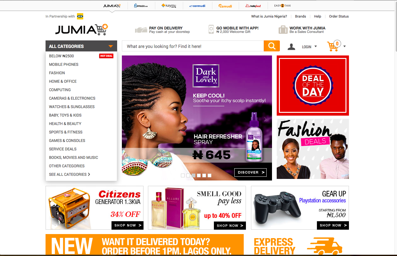
This is Jumia.
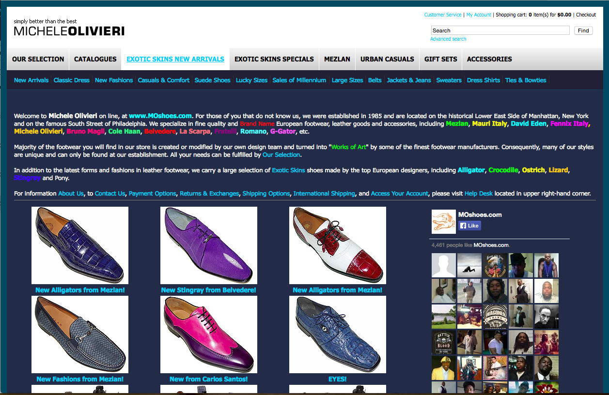
This is MicheleOlivieri.
So here is the quiz.
If you want to buy something online, which of these two sites will you spend more time on? Jumia or MicheleOlivieri?
Let us think for a moment and assume that MichelegOlivieri has:
- Better shoe selections
- Lower price (wholesale prices)
- No shipping cost
Despite all these supposed benefits, do you think MichelegOlivieri’s website will have a chance in the world to attract more sales that can beat the Jumia design that is more user-friendly?
Definitely, No!
Let’s Put Your Own Website Design to the Same Test.
Let’s say that you have a very brilliant idea, a fantastic product or perfect service and your website fails to impress potential customers.
This is a sure path to frustration.
I want to get this point clear to you.
For example, there is an interesting report from Gartner about how websites rank as the most important factor for marketing success.
Could this indicate that everything now depends on your website?
Majorly, it means that visitors make the decision to do business with you based purely on how your website looks (and how it does not look). A 2014 report claimed that 94% of people cited web design as the reason they mistrusted or rejected a website.
Nowadays, it is not uncommon for businesses to redesign their website once in a while for one reason or another. But one pitfall I have noticed is that businesses rarely take into account just how important their new website design is going to be for their digital marketing strategy in its entirety.
So how do you design for success?
Checkpoint One:
Make it Easy For Website Users to Find What They are Looking Forward to See…and Buy.
You have only 10 seconds to prove yourself.
Your website must convey a professional look to attract your target audience and build their trust to do business with you.
For instance, the moment your customer arrives at your website they are hit with a choice, “stay, or go”, and they’re going to make that choice in less than 10 seconds!
What is it that you want them to see? What is the first thing that they see?
Most commonly, the new website visitor is going to notice the way in which the site is laid out. They’re going to notice whether or not the initial impression meets their expectations from before they arrived.
If their expectations are met, they’ll stay.
Images are important.
Having images and graphics on your website is crucial – they help convey your message to your target audience as well as improved search engine rankings.
As they say, “a picture is worth a thousand words…” The more attractive an item looks, the longer people will want to look at it.
Have appropriate “Call To Action”.
A call-to-action is something that tells your visitors what you want them to do. Whatever you want your website visitors to do; put this on your website and make it stand out.
For instance, don’t just say, “Call Us Today!”… Instead, say, “Call Us Today on [INSERT YOUR PHONE NUMBER]. Do this by including your phone number – don’t make them search for it.
If you want them to come into your establishment, don t just say; “Come See Us Today!”… Instead, say, “Come See Us Today at [INSERT YOUR LOCATION]!”
Checkpoint Two:
Build an Email List.
Building a list of prospects and leads should be the priority of any business owner. They are the potential people that will end up buying your product and referring others.
If people are already visiting your website, this is the perfect opportunity to grab their contact information so you can continue to build a relationship with them.
Even when a website visitor has not converted into a customer, you should be aware that there might be some level of interest in your service. It is an opportunity to build on that interest and create momentum for further action.
Email is a permission-based marketing opportunity to continuously nurture prospects to clients.
Take a look at what this company is doing with their monthly newsletter:
- Sending product updates
- Contests and giveaways
- Company and industry news etc.
One of the easiest ways to capture leads is by installing a lead capture form on your website.
This is usually a form that asks visitors to enter their name and email address in exchange for a free offer – such as a coupon, free report, or whatever your customers would find extremely valuable.
Once you have these leads in your funnel, you can then start sending emails to them about your company.
Your emails should focus on building a relationship with your list and you should only send promotions from time to time.
When done correctly, your list will love you and continue to do business with you as long as you keep giving them what they want.
My Key Take Aways.
- Your website is a powerful marketing tool; you need to set it up with all of the proper components to help you generate more leads and sales.
- Your site must convey a professional look to attract your target audience and build their trust to do business with you.
Now is your turn to share; what will you change in your website design to improve your sales?
***
Wole Ogunlade is a digital marketing expert; he is the editor of SpokenTwice.com, a blog dedicated to teaching marketing topics covering conversion optimization, growth hacking and marketing automation strategies that are guaranteed to help technology startups and small business increase customers’ growth and sales.


