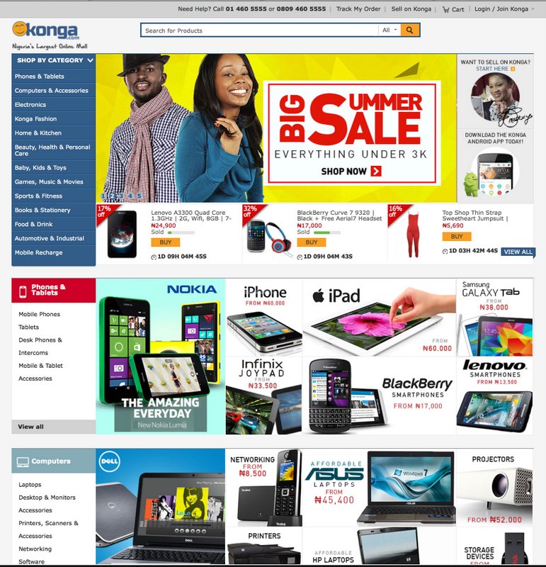
This is what it looks like now.
Of course you can just go and look at it directly.
The new design is mostly visual. It’s not obvious right away, but the changes will be apparent to regular shoppers. The designers have found a way to cram the site’s biggest categories onto the homepage and are hoping a combination of iconograpy and vibrant product banners will help users zero in on the products they are looking for. The search bar is sticky and follows the user when they scroll down. At the brand and product levels, there’s a bunch of stuff going on with search and price filters.
In the beginning, Konga went through a bit of an identity crisis, going through redesigns at a schizophrenic pace. I believe they have since found the look they were going for. These days, the visual design is mostly about tweaking user interaction and experience levers, and not branding.
This redesign of course has little to do with the backend. In November 2013, Konga made the jump to Magento, and not without a few issues. Timing the jump with a Black Friday promotion of course had a lot to do with the hiccups. Technical iterations of that nature happen less frequently for obvious reasons.