
Usability mistakes — they have become a routine for web designers and developers. Though the web has revealed the importance of website usability, web designers and developers rarely get with the programme.
Usability in web design is regarded as ensuring that users find the websites very easy to use and understand, effectual, helpful and pleasurable. One of the biggest challenges web designers face in web design is how to communicate their website design with intending users so that they can find it easy to use.
Sometimes, we assume that if we, as a web designer/developer can use a website, every user should be able to do so. Only it doesn’t work that way. When a website has usability problems, it is very difficult for users to effectively use the website, such users become frustrated and bounce! – it’s why some websites have high bounce rates.
A user wants to get important information on your website but doesn’t know how to even navigate the website, can’t even find where the search functionality is hidden. – Now, that is a nightmare! If a visitor doesn’t know how to go from your ‘home page’ to your ‘contact page’, they will leave your site.
You want to build a website that will be aesthetically pleasing to the eyes… Yes, but don’t drive your visitors away. Make your websites usable; offer your users amazing user experiences, which always lead to customer satisfaction. Delight your customers with brilliant design decisions.
Let’s take a look at some of the usability mistakes we make in our website design… and how to avoid them.
1. Zero navigation support
One of the major problems most visitors face with some websites is that it is hard moving around these sites. Some web designers make a lot of mistakes when it comes to providing navigation support for their websites, such as;
- Creating web pages that are not connected to the home page or any other web page on the website, such pages are known as ‘Orphan pages’.
- Creating web pages with unwarranted white space which will require users to keep scrolling down the page until there is nothing to scroll again.
- No search functionality or site map which will guide visitors around the site. Sometimes, the first thing people look for on a website especially if they are new to the site is the search box. Such visitors are called search-dominant users. The search box makes it easy for them to know what the site is all about without wasting so much time.
According to Jakob Nielsen of Nielsen Norman Group, “the search-dominant users will usually go straight for the search button when they enter a website: they are not interested in looking around the site; they are task-focused and want to find specific information as fast as possible.”
All you need to do to avoid driving your intending customers and/users away is to provide clear and self-explanatory navigation. Make sure there is search functionality in a visible corner. Let your site structure be visible and thought-out.
2. Open link in a new window
Okay, this is very common! Many designers make sure their web links open in a new window. I used to make this mistake too because I believed that is the best way to keep visitors on my website. However, it is a wrong move! Visitors always want to be in control of your web interface when they are interacting with it, if a designer’s decision doesn’t match that of the visitors, then that is a problem. Imposing links to open in a new window overrules the decision of the users. Users assume that when they open a link, it should open in the same window. Your website’s behaviour should meet your visitor’s expectation for a good user experience always.
Does your website open links in a new window?
3. Cluttering a page with content – no room to breathe
Some designers clutter their web pages with content – pictures, videos, buttons and other elements with no breathing space. To be sincere, this irritates me. The practice is usually because clients want to make more revenue via banner ads – colourful and distracting!
The value of white space is that it makes your page orderly – less clutter, and visitors can easily scan or read it. When there is an empty space between your pictures, paragraphs, videos and other elements, your content is readable; visitors will be relaxed when they are processing your spaced content. Instead of putting all your information on your home page, give your visitors a breathing space; let your users achieve their goals without getting confused.
4. Infinite scrolling is not for everyone
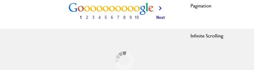
Why do you think Google adopted infinite scrolling for image search but pagination for text search results? Infinite scrolling puts all your content on one page. However, not all visitors scroll, especially if they are visiting your website for the first time. Some just view the content on the area that is visible on the screen without even scrolling down. That is why it is important to place your key content on a prominent position. However, crowding the upper area of your page with content will make your website inaccessible. When your visitors see too much information, they just stop looking and bounce out!
Internet in Nigeria can also make infinite scrolling frustrating. Try doing a search on Flickr.com when your internet is slow… you will want to smash your computer.
5. No help support
Help support is how users find answers to problems they may encounter on the website. It provides information that can be searched effortlessly and provides answers in a way that can be easily understood and followed, Such help support includes FAQ, help desk support, customer service or tech support. When there is no help support, users may find it very difficult to understand the website.
6. Mouse pointing instead of clicking
Although, most websites have not adopted full click-free website design, we have some click-free menu added on some websites. This feature does not put users in control of the web interface.
Maybe this is the future of web design? But it’s not encouraging!
In a bid to make our website design sexier, we have adopted a mouse-pointing feature instead of clicking. Now we design our websites in a way that when a mouse moves on a menu or link, it opens. This can be frustrating! If you haven’t experienced it, test it out on don’tclick.it – a click free website – to test interactive design. It looks amazing yet disturbing.
It’s very likely you have discovered some things you are doing wrong in your web design process. Web usability is about ensuring that your website is effective, easy to learn, and enjoyable from a user’s perspective. (I’ve always held on to this definition since my days in the university and it has always helped me.)
When you are designing an interface, you should always put your visitors first. The Eight Golden Rules of Interface Design by Ben Shneiderman, which is applicable to web designing, guides every design process. You should consider it too. Striking the right balance between satisfying your intending users and designing a beautiful website is in your hands as a designer. Don’t use a design element because it makes your website sexy; use it if it will help your users to achieve their goals.
If you have thoughts on this or any other usability mistakes you have made in the past, discuss this post on Radar.
Editor’s note: Kemi Ojo is a digital marketing expert and graphic designer. She is the Content Manager for online travel booking company, Travelstart. You can follow her on Twitter @keemiteand connect with her on linkedin.
Photo Credit: Matt From London via Compfight cc