I am not going to get into why I dislike iOS devices. This is simply an unbiased and objective look at Apple’s largest tablet; the recently unveiled iPad Pro.
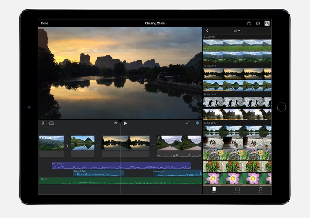
It has a larger screen: 12.9 inches. Also there are more pixels. Not that I am impressed by that sort of thing. Personally, 720p is more than adequate for mobile hand held devices; 1080p at the most. Anything higher is superfluous. But that’s another matter.
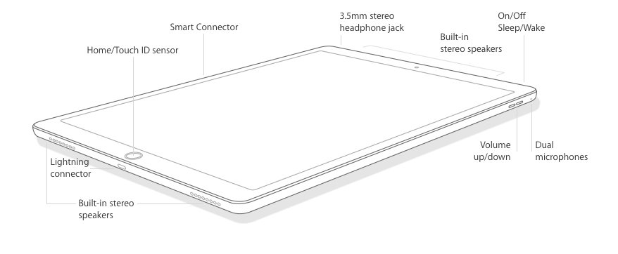
It has four speakers. That’s nice. I don’t know how well they sound but even if they are really good, I would still prefer headphones just so others are not disturbed. While on the subject, I find it puzzling that OEMs see fit to ship phones with headphones but for some mysterious reason, refuse to do so for tablets and laptops. I don’t know of any tablet that ships with headphones – I stand to be corrected.
It also has a newer and faster processor – the A9X. However, until a paradigm shift occurs, most processors for mainstream computing devices (desktop and mobile) are already quite fast. Like automotive horsepower, any speed increments in newer processors are to most users, perceived rather than observed.
Perceived Problems
(i) It doesn’t have a built-in stand.
(ii) It has no USB port. This is an inexcusable omission.
(iii) No backlit keyboard. Other accessory manufacturers like Logitech will surely make one.
The Pencil. Let’s call it what it is – a stylus. In one word: bewildering. Why does it need a battery? It doesn’t seem to be capable of anything the styluses of the Microsoft Surface and Samsung Galaxy Note devices aren’t capable of. Even then, the battery needs to be charged. It would surely be better if the tablet had a built-in space to charge the stylus when not in use alà Samsung Galaxy Note series (sans charging). Though, like I said, I don’t know why it needs a battery in the first place.
And as MKBHD pointed out, plugging the stylus into the tablet to charge it will surely make it very easy to break. Furthermore, unless the stylus can bend and rotate at the point after the connector (no mention has been made of that), it seems that the only safe place to charge it is in a Lightning Dock. Plugging it into the tablet makes the tablet itself near unusable and unsightly.
Also, the cap that covers the stylus’s lightning connector is also likely to be lost. Though since Lightning charging cables have that end exposed anyway, losing it will only be an aesthetic problem rather than a functional one.
Now, Sir Jonathan Ive likes to stand in front of every hardware design (and now user interface) that comes out of Apple. That being the case, it only seems appropriate that he takes the flak for the iPad Pro’s stylus. Its execution is horrible. The idea for how it has been executed should never have left the labs.
With all respect, it also shows Tim Cook’s shortcomings. I assume nothing gets released or unveiled without his approval and yet he approved this stylus with its clumsy charging mechanism. I’ve said it before that that the problems bedeviling Apple Maps were his fault and no one else’s.
All in all, the iPad Pro is simply a larger iPad and nothing more. Comparing it to the likes of the Microsoft Surface 3 series is just wrong. They are not in the same league. However, the emergence of the iPad Pro has caused me to revisit the idea of what features or attributes qualify a device as pro or enterprise. Such features include full compatibility with and the ability to run software designed for the desktop (in this case, OS X) and that’s something iOS9 just can’t do.
Editor’s note: This post appeared first on Wale Sanni’s blog as “Apple iPad Pro: First Impressions”. You can follow him on Twitter @waleesa1.
Image via: macworld


