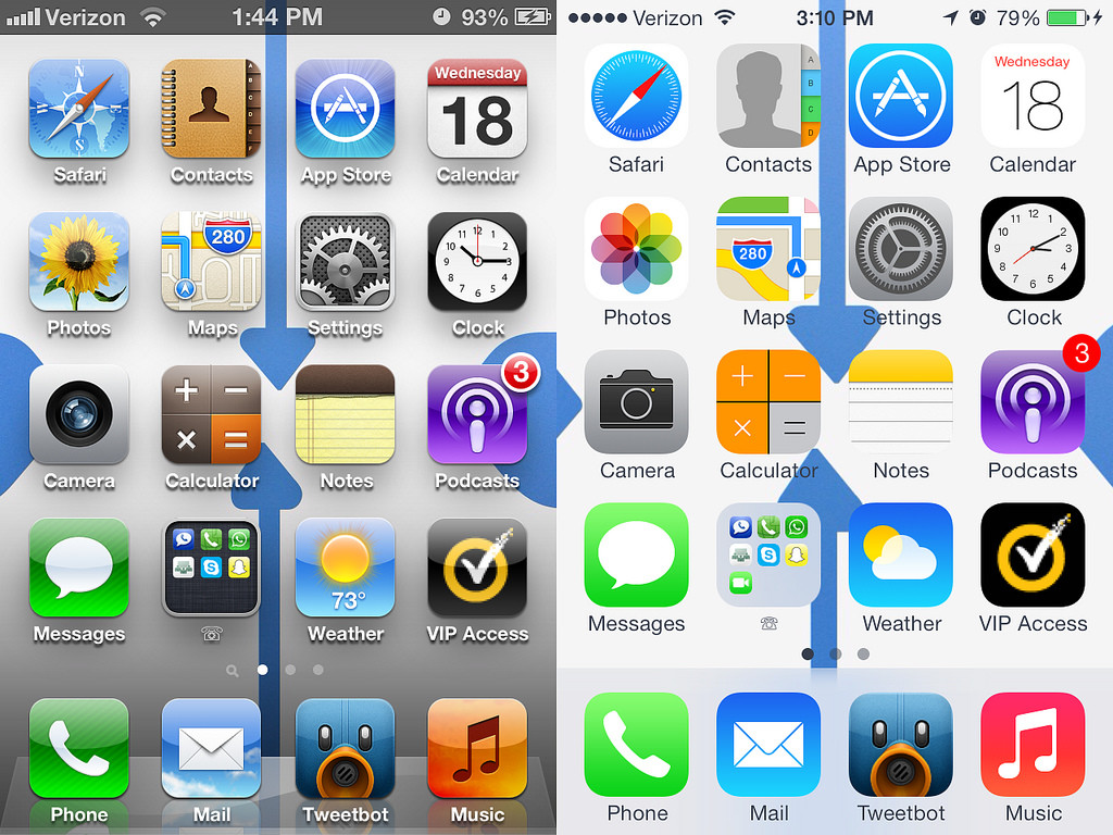
In June 2013, Apple announced the release of iOS 7 – a drastic departure from the gradient, bubbly, skeuomorphic design language in iOS 6. The fanboy camp was split sharply into two factions: those who believed Apple could do no wrong, and embraced the change with open arms, and others – like me, who called bullshit, holding the position that the change was distinctly un-Apple, and that Steve Jobs would not have been proud of it. I resisted the change, refusing to update my iPad until a crash forced me to install iOS 8, and since then, looking back at iOS 6 and other skeuomorphic UIs, they’ve seemed terribly dated, and I wonder how we ever thought them visually pleasing.
The entire point of skeuomorphism was to provide as identical an interface to the real world, as a computer could render, since many users at the time had spent most of their lives interacting with actual objects. Now that the world had gotten accustomed to interacting with devices, rather than real world objects, to quote John Pavlus, “Skeuomorphism is a solution to a problem iOS (and by extension all operating systems) no longer has.”
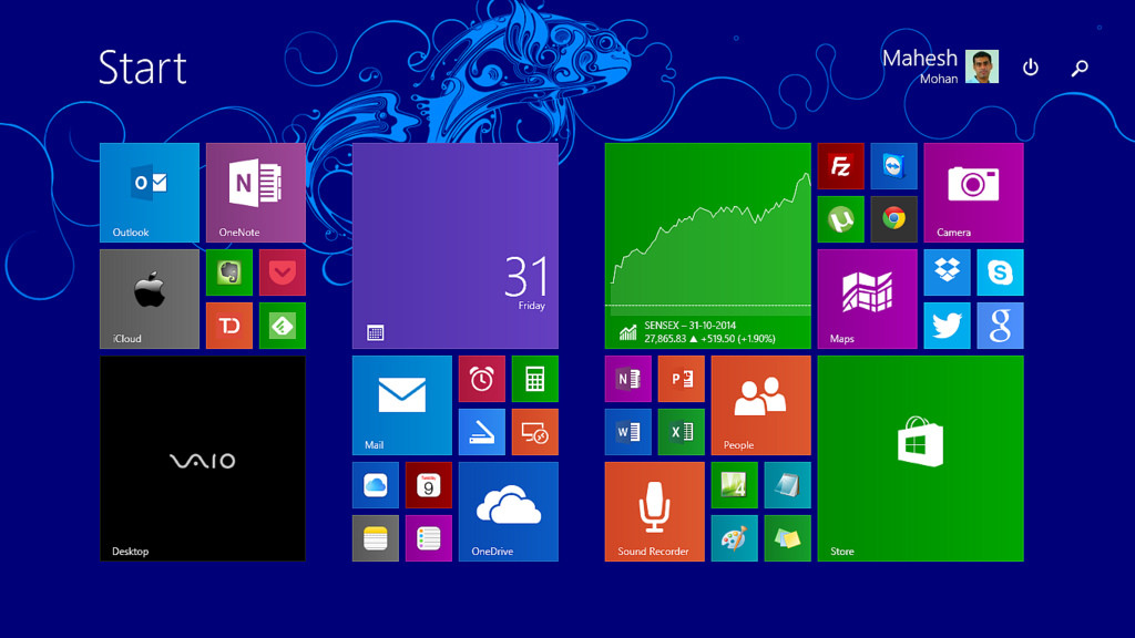
Flat Design, as executed by Apple in iOS and OSX, Material Design as implemented by Google, and Microsoft’s Metro Design all have one thing in common – Minimalism. They all manage to strip away all the extravagant, faux-realistic design elements, leaving the user to focus on the content they should be focusing on. With each iteration of their operating systems, more and more users have gotten accustomed to UIs deferring to content, and providing subtle visual cues, to inform them about the functions of different design elements.
As time goes on, design paradigms are slowly but surely nudging UI designers to downplay elements that have no fundamental function in the arrangement. I envision a future where the UI completely disappears, and the users can communicate directly with the devices they need to use. Don’t believe me?
Think about the Internet of Things, arguably the future of human – device interaction, where everyday objects are transformed into intelligent nodes on a network. They will keep on acting like real world objects. We won’t fit a coffee maker, or a blanket with an LCD screen, just to make it intelligent. It will perform its duties as expected, without any software UI to get in the way of things, and the end user will interact with it, like any other object of its kind.
Think about Wearable Tech, like the Apple Watch and Google Glass, which won’t have to be modified to accommodate a traditional UI.
Think about mind reading helmets, and smart musical instruments.
Think about Pranav Mistry’s Sixth Sense technology.
It’s exciting to imagine what the world will look like when UI designers have to pivot to UX, instead of designing the stirrups and saddle for the horse, designing the feeling the rider gets when he gets on.
Instead of thinking about design in terms of pretty typography, bezels, and gradients, having to think about it in terms of how each element used will affect the user’s perception of the product.
I’m earnestly looking forward to it.
Photos Credit: Canned Tuna, Frankrolf, Maheshone


